KPI Cards
Learn how to create and configure KPI cards in Semaphor
Overview
KPI (Key Performance Indicator) cards display important metrics in a clear, focused format. Use them to track single values, compare performance across time periods, or display multiple related metrics together.
Single Metric KPI
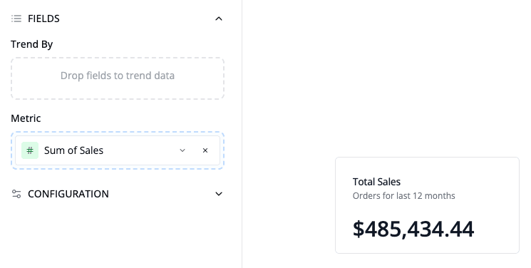
Create a single metric KPI by adding one metric without any groupBy fields. This displays a large, prominent value with an optional title and description.
How to create:
- Add a metric (e.g., Sum of Sales)
- Do not add any groupBy fields
- Set a descriptive title
Period Comparison KPI
Period comparison KPIs show how a metric changes against a previous period, previous year, or fixed target. See Metric Comparisons for the complete mental model, precedence rules, and availability behavior.
To configure an explicit KPI comparison:
- Add a metric to a KPI visual.
- Give the KPI a date to compare over: a Trend By date shown on the card, a date field you set for it, or the dataset's primary date field.
- Select a date range with a start and end, from Global Date or on the card.
- Open the metric settings and choose Previous Period, Previous Year, Target, Off, or Inherit dashboard comparison.
- For a period comparison, configure the offset, To date behavior, and calendar or weekday alignment.
For a single-value KPI, you don't need to add the date to Trend By when it already comes from the card or the dataset.
When the metric is set to Inherit dashboard comparison, a viewer can select Previous period or Previous year from the Global Date control. An explicit metric comparison or Off setting takes precedence over that viewer selection.
The card displays:
- Large current value in the center
- Delta indicator next to the current value
- "Previous: [value]" below the main value
- Compact Comparison badge with resolved windows and configuration details
Comparison Configuration
The metric settings choose the baseline and favorable direction. The visual's Comparison section controls how the result is presented.
Calculation Type
Choose how the comparison is calculated:
| Type | Formula | Example |
|---|---|---|
| Difference | Current − comparison | Sales increased by $5,000 |
| Percent change | (Current − comparison) ÷ | comparison | | Sales increased by 25% |
| Both | Percentage and absolute difference | Sales increased by 25% ($5,000) |
| Ratio | Current ÷ comparison | Current sales are 1.25× the baseline |
Format Options
Difference inherits the metric's compatible number formatting by default. Percent change and ratio support 0–6 decimal places.
Indicator Settings
Customize the comparison badge:
- Indicator - Arrow + badge, Arrow, Badge, or None
- Color - Enable or disable sentiment color and customize increase, decrease, and no-change colors
- Favorable direction - Higher is better, Lower is better, or Neutral
Higher is better is the default. If a metric's favorable direction is set in your semantic model, that setting wins over the visual setting.
Labels
Conditional Labels - Display dynamic labels based on the comparison result:
- Increase - Shown when current > previous (default: "Increase")
- Decrease - Shown when current < previous (default: "Decrease")
- No Change - Shown when values are equal (default: "No change")
Comparison Label - Customize the comparison label (default: "Previous")
- Examples: "Last Month", "Last Year", "Last Period"
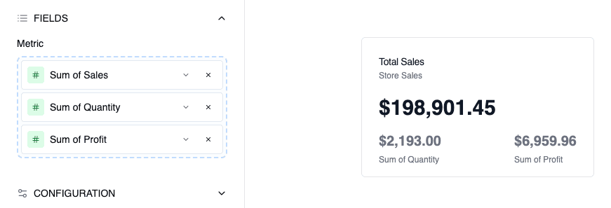
Multi-Metric KPI (Up to 3 Metrics)
Display multiple related metrics in a single card when you need to show current performance alongside benchmarks or historical values.
How to create:
- Add up to 3 metrics (e.g., Current Period, Previous Period, Budget)
- Do not add any groupBy fields
Layout:
- Primary metric displays large at the top
- Secondary and tertiary metrics display side-by-side below in a 2-column grid
- Each metric shows its own label
- Card title typically describes the primary metric
The separate Enable metric comparison option on a two-metric KPI compares those two displayed metrics. It is not a period-over-period baseline. When several headline measures each need their own period comparison, use separate single-metric KPI cards so each result has an unambiguous value, baseline, and favorable direction.
Formatting
Number Formatting
- Decimal Places - Control precision (0-10 decimal places)
- Thousands Separator - Automatic based on locale
- Compact Notation - Display large numbers with K, M, B suffixes
Currency Formatting
- Currency Symbol - Select from major currencies (USD, EUR, GBP, etc.)
- Locale - Controls number formatting and symbol position
- Custom Symbol - Override default currency symbol if needed
Percentage Display
- Multiply by 100 - Automatically convert decimals (0.25 → 25%)
- Decimal Precision - Control decimal places for percentages
Color Ranges
Apply conditional coloring based on value thresholds:
- Define ranges (e.g., 0-50: Red, 50-75: Yellow, 75-100: Green)
- Values automatically colored based on their range
- Useful for status indicators and performance tracking
Best Practices
Single Metric KPIs:
- Use for the most important top-line metrics
- Keep titles clear and specific
- Add descriptions for context when needed
Period Comparison KPIs:
- Best for tracking trends over time
- Choose the baseline that matches your analysis period
- Customize "Previous" label to match your time period
Multi-Metric KPIs:
- Ideal for showing current value with context (previous, budget, target)
- Upto to 3 metrics for readability
- Use clear, concise labels for each metric
- Primary metric should be the most important value