Click Interactions
Learn how to create interactive click-based experiences in Semaphor dashboards
Overview
Interactions allow you to create click-based behaviors in your dashboards. When users click on chart elements (bars, lines, pie slices, table rows), you can trigger actions like filtering other cards, navigating to different dashboards, or opening external URLs.
All interactions follow a consistent 3-step configuration pattern:
- When I click on → Select a trigger (metric or attribute)
- I want to → Choose an action
- Configure → Set action-specific options
Semaphor supports five interaction types:
- Cross Filter - Filter other cards on the dashboard
- Drill into Dashboard - Navigate to another dashboard with context
- Drill into Insight - View a saved visualization in a modal or inline
- Drill Down - Navigate through hierarchies (e.g., Country → State → City)
- Drill into URL - Open custom URLs with dynamic parameters
Click Selection Behavior
The type of chart element you click determines what data is captured.
Value of Metric (Intersection Behavior)
When you click on a metric value (the actual data visualization element like a bar, line point, or pie slice), the system captures all dimensions that define that data point.
Why? A metric value exists at the intersection of multiple dimensions. A bar in a stacked bar chart represents sales for a specific country AND state combination. Capturing all dimensions preserves the complete context.
Example 1: Stacked Bar Chart
Chart: Sum of Sales by Country, stacked by State
Click on: Bar segment showing $45K for USA/California

Captured filters:
- country = 'USA'
- state = 'California'

Filter propagated: country='USA' AND state='California'
Example 2: Multi-Dimensional Line Chart
Chart: Count of Orders over Time by Product Category
Click on: Line point in March for Electronics

Captured filters:
- month = 'March 2025'
- category = 'Electronics'

Filter propagated: month='March 2025' AND category='Electronics'
Example 3: Grouped Bar Chart
Chart: Revenue and Profit by Region and Quarter
Click on: Revenue bar for Q1 West region

Captured filters:
- quarter = 'Q1'
- region = 'West'

Filter propagated: quarter='Q1' AND region='West'
Multiple Metrics = Multiple Interactions
When a chart displays multiple metrics, you can configure a separate interaction for each one. Each metric can have its own distinct action.
Chart: User Metrics over Time with three metrics
- Monthly Active Users (blue line)
- Monthly Revenue (green line)
- Conversion Rate (orange line)

Interaction 1: Click "Monthly Active Users" → Drill to Insight showing user demographics
Interaction 2: Click "Monthly Revenue" → Drill to Dashboard showing revenue breakdown
Interaction 3: Click "Conversion Rate" → Drill to Insight showing conversion funnel

Result: Each metric tells its own story through specialized drill destinations
Key takeaway: All dimensional context that defines the clicked metric value flows through the interaction.
Value of Attribute (Single Dimension)
When you click on an attribute value (like an axis label), the system captures only that specific attribute, not any other dimensions present in the chart.
Why? Attributes represent categorical values independent of metrics. Even if the chart displays multiple dimensions, clicking on "California" means you want to filter by California specifically - not by all dimensions in that visualization.
Example 1: X-Axis Label
Chart: Sales by Country and State (stacked bars)
Click on: "USA" label on X-axis

Captured filter:
- country = 'USA'

Filter propagated: country='USA'
(State is NOT included, even though bars are stacked by state)
Example 2: Pie Chart Segment Label
Chart: Market Share by Region
Click on: "West" label next to a pie slice

Captured filter:
- region = 'West'

Filter propagated: region='West'
Key takeaway: Only the specific attribute clicked is captured, creating a focused filter on that dimension alone.
Multi-Metric Charts (Selective Triggering)
When a chart displays multiple metrics (e.g., revenue, profit, and orders), interactions can be configured to trigger only when a specific metric's visual element is clicked.
Why? Different metrics often require different actions. You may want clicking revenue to drill into a financial dashboard, while clicking orders drills into an operations dashboard.
Example:
Chart: Orders over Time with three metrics
- #count_of_orders (blue bars)
- #sum_of_sales (green bars)
- #sum_of_profit (orange bars)

Interaction configured: "When I click on #count_of_orders" → Drill to Operations Dashboard

User clicks blue bar for January:
✅ Interaction triggers
Captured filter: month='January'

User clicks green or orange bar:
❌ Interaction does NOT trigger
Multiple interactions on same chart:
Interaction 1: Click #sum_of_sales → Drill to Finance Dashboard
Interaction 2: Click #count_of_orders → Drill to Operations Dashboard

User clicks green bar (sales):
→ Navigates to Finance Dashboard

User clicks blue bar (orders):
→ Navigates to Operations Dashboard
This allows each metric to have its own distinct behavior.
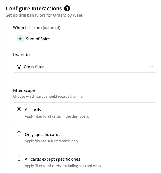
Cross Filter
Click a chart element to filter other cards on the dashboard.
Configuration Steps
Step 1: Select What to Click
- Open the Interactions panel in the Visual editor
- Click + Add interaction
- Choose your trigger type:
- Value of Metric - Shows all metrics in your card (e.g.,
#count_of_orders) - Value of Attribute - Shows all dimensions (e.g., country, category)
- Value of Metric - Shows all metrics in your card (e.g.,
Step 2: Choose Cross Filter Action
- In the "I want to" section, click Choose action
- Select Cross filter
A tooltip explains: "Filter other cards on the dashboard based on the selected value"
Step 3: Select Filter Scope
Choose which cards to filter:
| Scope | Description | Use Case |
|---|---|---|
| All cards | Filters every card on the dashboard | Most common, default behavior |
| Only specific cards | Select which cards to include | Precise control over which cards are filtered |
| All cards except | Exclude certain cards | Filter everything except specific cards |
Selecting Specific Cards
After choosing "Only specific cards" or "All cards except":
- Click the card selector dropdown
- Check/uncheck cards in the list
- Selected cards appear as removable tags below
- Click × on any tag to remove that card
Example Configuration
When I click on: #Revenue (metric)
I want to: Cross filter
Filter scope: Only specific cards
Selected cards:
  • Product Performance
  • Regional Sales
  • Customer Metrics
Result: Clicking the Revenue metric filters only the three selected cards.
Drill into Dashboard
Navigate to another dashboard, passing click context as filters.
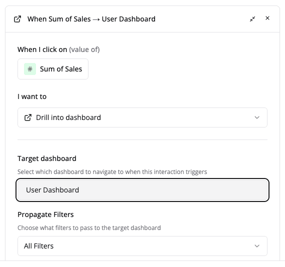
Configuration Steps
- Select your trigger (metric or attribute)
- Choose Drill into dashboard action
- Click Choose dashboard to open the picker
Dashboard Picker
The dashboard picker includes:
- Search bar - Filter dashboards by name
- Two tabs:
- "created by me" - Your personal dashboards (default)
- "all" - All accessible dashboards
- Dashboard cards showing:
- Dashboard name
- Description (if available)
- Last modified timestamp
Context Modes
When drilling to a dashboard, you can control what context gets passed:
| Mode | What Gets Passed | Use Case |
|---|---|---|
| Interaction Filters | Only the clicked values | Focused drill-down with minimal context |
| Full Context | Clicked values + all active dashboard filters | Preserve complete filter state |
| No Context | Nothing | Start fresh, no filters applied |
Example
When I click on: Country (attribute)
I want to: Drill into dashboard
Target: Regional Sales Dashboard
Context mode: Interaction Filters

Result:
Click "USA" → Navigate to Regional Sales Dashboard
Filters applied: country='USA'
Ensure the target dashboard has filters configured to receive the passed context. Field names must match exactly.
Drill into Insight
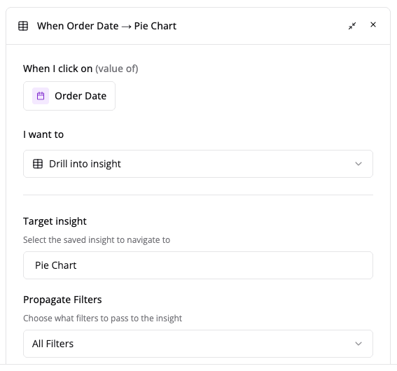
View a saved visualization (insight) with applied filters, either in a modal overlay or as an inline replacement.
What are Insights?
Insights are saved visualizations that can be reused across dashboards. When you drill into an insight, you can:
- View it in a modal (large overlay)
- Replace the current card content (inline)
Configuration Steps
- Select your trigger (metric or attribute)
- Choose Drill into insight action
- Click Choose insight to open the picker
Insight Picker
The insight picker shows:
- Search bar - Filter by insight name
- Two tabs: "created by me" | "all"
- Insight items with:
- 📊 icon for valid insights
- × icon for invalid/deleted insights
- Last modified timestamp
Display Modes
| Mode | Behavior | Use Case |
|---|---|---|
| Modal | Opens insight in large overlay (90% viewport) | Quick reference without leaving dashboard |
| Replace Card | Swaps current card content with insight | Deeper inline analysis |
Modal Display:
- Large overlay covers most of the screen
- Click outside or press ESC to close
- Returns to original dashboard view
Replace Card Display:
- Insight content replaces the card
- Breadcrumbs or back button appear
- Click to return to original card
Example
When I click on: Product Category (attribute)
I want to: Drill into insight
Target: Product Details insight
Display mode: Modal
Context mode: Interaction Filters

Result:
Click "Electronics" → Modal opens showing Product Details
Filters applied: category='Electronics'
Drill Down
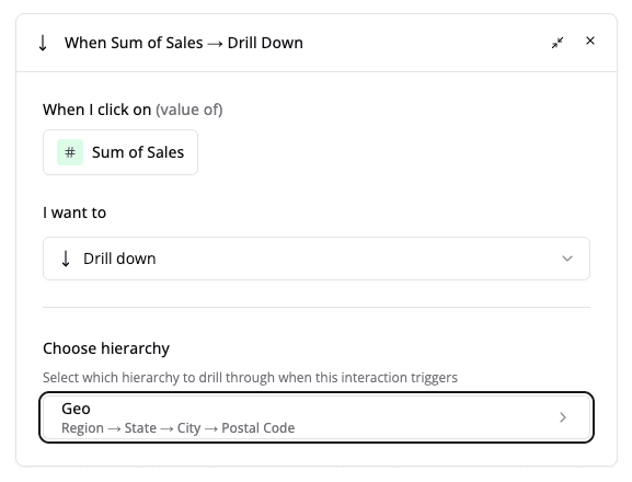
Navigate through a predefined hierarchy (e.g., Country → State → City) by drilling deeper with each click.
What are Hierarchies?
Hierarchies are predefined sequences of fields to drill through. Each click drills one level deeper.
Common hierarchy types:
- Location - Country → State → City
- Time - Year → Quarter → Month → Day
- Product - Category → Subcategory → Product
- Organization - Division → Department → Team
Configuration Steps
- Select your trigger (typically a metric)
- Choose Drill down action
- Click Choose hierarchy
Hierarchy Picker
The hierarchy picker displays available hierarchies with their drill paths:
📍 Location Hierarchy
   Country → State → City

📅 Time Hierarchy
   Year → Quarter → Month → Day

📦 Product Hierarchy
   Category → Subcategory → Product
Click + Create new to define custom hierarchies.
Drill Behavior
How it works:
- First click drills to level 2 (e.g., State)
- Second click drills to level 3 (e.g., City)
- Each drill applies a filter for the clicked value
- Breadcrumbs appear at the top showing drill path
- Click breadcrumbs to drill back up
Example: Location Drill Down
Initial State:
Chart: Sales by Country
No filters active
User clicks "USA":
Chart updates to: Sales by State
Filter applied: country='USA'
Breadcrumb: USA
User clicks "California":
Chart updates to: Sales by City
Filters applied: country='USA', state='California'
Breadcrumb: USA > California
User clicks "USA" in breadcrumb:
Chart returns to: Sales by State
Filter applied: country='USA'
Breadcrumb: USA
Drill into URL
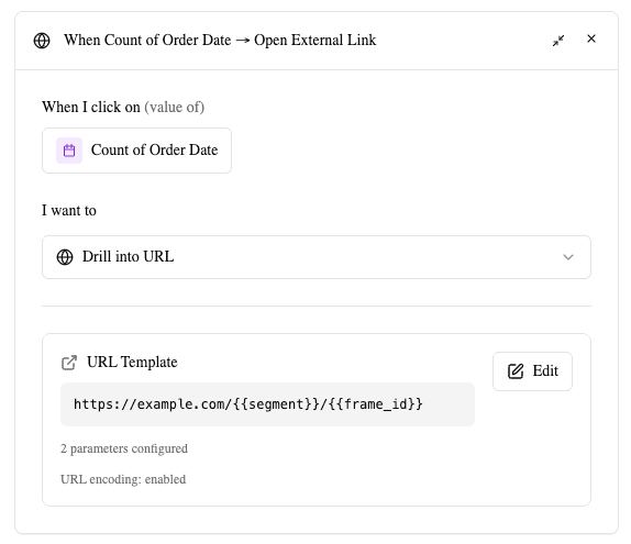
Navigate to a custom URL with dynamic parameters from the click context and dashboard state.
URL Builder
The URL builder features a two-panel layout:
Left Panel: URL Template
- Large textarea for entering your URL
- Supports parameter placeholders:
{{parameter_name}} - Live preview below shows example URL
Right Panel: Parameters
- Browse and insert available parameters
- Click any parameter to insert at cursor position
- Organized into categories
Available Parameters
Attributes - Values from clicked chart data:
- All groupBy and pivotBy fields from the current card
- Example:
{{country}},{{product}},{{order_date}} - Shows field name and qualified field path
Identifiers - System identifiers:
{{card_id}}- Current card ID{{frame_id}}- Current frame ID{{sheet_id}}- Current sheet ID
Configuration Steps
- Select your trigger (metric or attribute)
- Choose Drill into URL action
- Click Add Custom URL to open the builder
- Build your URL template:
- Type the base URL in the left panel
- Click parameters in the right panel to insert
- Parameters auto-insert as
{{parameter_name}}at cursor position
- Optional: Customize the menu label
- Click Save
URL Encoding
The URL encode parameters checkbox (enabled by default) controls how parameter values are encoded:
- Enabled - Special characters are encoded (e.g., spaces →
%20) - Disabled - Raw values are inserted
Recommendation: Keep enabled to ensure valid URLs with special characters.
URL encoding is recommended to handle special characters like spaces, ampersands, and quotes in parameter values.
Menu Label Customization
The menu label field allows you to customize how this interaction appears when multiple interactions are available.
- Default label: "Open External Link"
- Custom examples: "View Order Details", "Open Support Portal", "See Full Report"
Example Configuration
URL Template:
https://erp.company.com/orders/{{order_id}}?status={{status}}®ion={{region}}&card={{card_id}}When user clicks:
- Order ID: "12345"
- Status: "Shipped"
- Region: "West Coast"
- Card ID: "abc123"
Generated URL:
https://erp.company.com/orders/12345?status=Shipped®ion=West%20Coast&card=abc123URLs always open in a new browser tab. Ensure proper security measures when linking to external systems.
Multiple Interactions
You can configure multiple interactions on the same card for different triggers or actions.
Use Cases
Different metrics, different actions:
Interaction 1: Click "Revenue" → Drill to Finance Dashboard
Interaction 2: Click "Units Sold" → Cross filter other cards
Different attributes, different destinations:
Interaction 1: Click "Product" → Drill down product hierarchy
Interaction 2: Click "Region" → Cross filter by region
Combined workflows:
Interaction 1: Click "Category" → Drill down product hierarchy
Interaction 2: Click "Status" → Cross filter dashboard
Interaction 3: Click "Order ID" → Drill to URL (external system)
Managing Multiple Interactions
- Each interaction is displayed as a separate card in the Interactions panel
- Click Edit to modify an interaction
- Click × to remove an individual interaction
- Click + Add interaction to add more
- No technical limit to the number of interactions per card
Interaction Selection Menu
When multiple interactions could trigger from a single click, a popup menu appears:
- Menu displays at the click location
- Lists all matching interactions with icons and labels
- User selects which action to execute
- Custom menu labels help differentiate options