Custom Components
Build custom visualizations and filters for Semaphor dashboards using React, TypeScript, and Tailwind CSS.
Table of Contents
- Introduction
- Quick Start
- AI-Assisted Development with Claude
- Project Structure
- Local Development
- Building Custom Visuals
- Building Custom Filters
- Props Reference
- Rendering Inline Filters
- Settings & Configuration
- Theming
- Documentation & Metadata
- Publishing to Semaphor
- Troubleshooting
- Best Practices
- API Reference
- Support
Introduction
Why Custom Plugins?
When embedding analytics into your application, standard chart libraries often fall short. You need:
- Trade Analytics: Specialized maps showing import/export flows with custom annotations
- Financial Dashboards: Tables with precise formatting, sorting, and conditional highlighting
- HR Tools: Demographic visualizations with specific compliance requirements
- Healthcare: Patient flow diagrams, appointment timelines, resource utilization views
Most BI tools lock you into their charting libraries. Semaphor's plugin architecture gives you complete control to bring your own React components, style them your way, and integrate seamlessly with Semaphor platform.
Micro Frontend Architecture
Semaphor plugins follow the micro frontend pattern—small, independently deployable frontend applications that integrate into a larger platform at runtime.
┌─────────────────────────────────────────────────────────────────────────────┐
│                         SEMAPHOR PLATFORM                                   │
│                                                                             │
│   ┌───────────────┐    ┌────────────────────────────────────────────────┐   │
│   │               │    │                                                │   │
│   │  Built-in     │    │  YOUR PLUGIN (Micro Frontend)                  │   │
│   │  Charts       │    │  ┌──────────────┐ ┌──────────────┐ ┌────────┐  │   │
│   │               │    │  │ RevenueChart │ │ SummaryTable │ │ MyMap  │  │   │
│   │  Semaphor     │    │  └──────────────┘ └──────────────┘ └────────┘  │   │
│   │  Core         │    │                                                │   │
│   │               │    │  One bundle, multiple visuals & filters        │   │
│   └───────────────┘    └────────────────────────────────────────────────┘   │
│                                                                             │
│   Loaded at runtime ──────────────────────────────────────────────────────► │
│                                                                             │
└─────────────────────────────────────────────────────────────────────────────┘
One Plugin, Many Components — Bundle all your custom visuals and filters into a single plugin. This keeps the bundle size small by sharing dependencies (React, Tailwind, utilities) across components.
Why Micro Frontends?
| Benefit | Description |
|---|---|
| Independent Deployment | Ship plugin updates without touching Semaphor core |
| Technology Freedom | Use any React-compatible libraries (D3, Recharts, ECharts, etc.) |
| Team Autonomy | Different teams can own different visualizations |
| Isolation | Plugin bugs don't crash the main application |
| Lightweight | Only load what you need, when you need it |
What You Can Build
| Component Type | Description | Examples |
|---|---|---|
| Custom Visuals | React components that render query data | Charts, tables, KPIs, maps, Gantt charts, custom widgets |
| Custom Filters | Alternative filter UI components | Chip selectors, sliders, calendar pickers, tree selectors |
How It Works
┌─────────────────────────────────────────────────────────────────────────────┐
│                           YOUR PLUGIN                                       │
│                                                                             │
│   ┌─────────────────┐    ┌─────────────────┐    ┌─────────────────┐         │
│   │  Component.tsx  │    │  Component.data │    │ components.     │         │
│   │  (React code)   │    │  (Sample data)  │    │ config.ts       │         │
│   └────────┬────────┘    └────────┬────────┘    └────────┬────────┘         │
│            │                      │                      │                  │
│            └──────────────────────┼──────────────────────┘                  │
│                                   ▼                                         │
│                          ┌────────────────┐                                 │
│                          │   npm build    │                                 │
│                          └────────┬───────┘                                 │
│                                   ▼                                         │
│                          ┌────────────────┐                                 │
│                          │ Plugin Bundle  │                                 │
│                          └────────┬───────┘                                 │
└───────────────────────────────────┼─────────────────────────────────────────┘
                                    │
                                    ▼ semaphor publish
                        ┌───────────────────────┐
                        │   SEMAPHOR PLATFORM   │
                        │                       │
                        │  Your plugin appears  │
                        │  in the chart type    │
                        │  selector             │
                        └───────────────────────┘
Semaphor handles the hard parts:
- Security and Multi-tenancy
- State management and cascading
- Authentication and permissions
- Query processing and data fetching
- Theme synchronization
- Caching and performance optimization
You focus on:
- Your visualization
- Your styling preferences
- Your user experience
Quick Start
Prerequisites
- Node.js v18 or higher
- npm or yarn
- Semaphor account with an active project
Installation
# Clone the quickstart template
git clone https://github.com/semaphor-cloud/semaphor-plugin-quickstart.git
cd semaphor-plugin-quickstart

# Install dependencies
npm install
Development
# Start the local development server
npm run dev
This opens the Showcase Gallery at http://localhost:5173 where you can:
- Preview all custom visuals and filters
- Test with sample data
- View component documentation
Build & Publish
# Install CLI (one-time setup)
npm install -g semaphor-cli

# Initialize your plugin (one-time)
semaphor init

# Build and publish
npm run build
semaphor publish
Your plugin is now available in Semaphor's chart type selector.
AI-Assisted Development with Claude
Speed up your plugin development using Claude Code. The quickstart project includes specialized skills that let Claude generate complete, working components in a single shot.
Quick Generation with Claude
# Open Claude Code in the plugin project
claude

# Generate a custom visual
> /create-visual

# Generate a custom filter
> /create-filter
Claude will ask for a component name and description, then automatically:
- Create the component file with proper TypeScript types
- Create sample data for the Showcase
- Register the component in
components.config.ts - Export from
index.ts - Add to
sample-data-registry.ts
Example Workflow
You: /create-visual

Claude: What should the component be called?
You: Sales Heatmap

Claude: What does it visualize?
You: A heatmap showing sales performance by region and time period

Claude: Creating SalesHeatmap component...
✓ Created src/components/semaphor-components/sales-heatmap/sales-heatmap.tsx
✓ Created src/components/semaphor-components/sales-heatmap/sales-heatmap.data.ts
✓ Updated components.config.ts
✓ Updated index.ts
✓ Updated sample-data-registry.ts

Run `npm run dev` to preview in the Showcase.
Available Skills
| Skill | Command | Description |
|---|---|---|
| Create Visual | /create-visual | Generate a custom visualization component |
| Create Filter | /create-filter | Generate a custom filter component |
Tips for Better Results
- Be specific: "A donut chart with center label showing percentage" works better than "a chart"
- Mention libraries: "Use Recharts for the bar chart" if you have a preference
- Describe interactions: "Clicking a bar should highlight it and show a tooltip"
After Claude generates your component, you can ask follow-up questions to refine it:
You: Can you add a legend below the chart?
You: Make the colors match our brand palette
You: Add animation when data changes
Project Structure
semaphor-plugin-quickstart/
│
├── src/
│   │
│   ├── components/
│   │   │
│   │   ├── components.config.ts      # Define component names, settings, docs
│   │   │
│   │   │
│   │   ├── config-types.ts           # TypeScript type definitions
│   │   │
│   │   ├── index.ts                  # All components must be exported here
│   │   │
│   │   └── semaphor-components/      # Your custom components
│   │       │
│   │       ├── my-table/
│   │       │   ├── my-table.tsx      # React component
│   │       │   └── my-table.data.ts  # Sample data for Showcase
│   │       │
│   │       ├── summary-table/
│   │       │   ├── summary-table.tsx
│   │       │   └── summary-table.data.ts
│   │       │
│   │       └── chip-filter/
│   │           ├── chip-filter.tsx
│   │           └── chip-filter.data.ts
│   │
│   ├── showcase/                     # Local development gallery
│   │   ├── showcase.tsx              # Gallery UI
│   │   ├── component-card.tsx        # Component preview renderer
│   │   ├── doc-panel.tsx             # Documentation panel
│   │   └── sample-data-registry.ts   # Sample data mappings
│   │
│   ├── App.tsx                       # Application entry point
│   └── main.tsx                      # React bootstrap
│
├── dist/                             # Build output (generated)
│   ├── index.js                      # Bundled JavaScript
│   └── manifest.json                 # Component metadata
│
└── package.json
Key Files Reference
| File | Purpose | When to Edit |
|---|---|---|
semaphor-components/*/[name].tsx | React component implementation | Creating/editing components |
semaphor-components/*/[name].data.ts | Sample data for Showcase | Creating components |
components.config.ts | Plugin manifest (names, settings, docs) | Adding/configuring components |
index.ts | Component exports | Adding components |
sample-data-registry.ts | Links components to sample data | Adding components |
Local Development
The Showcase Gallery
When you run npm run dev, the Showcase Gallery provides a preview of your components. The showcase gives you:
- Instant Feedback — Hot reload shows changes immediately
- Realistic Testing — Sample data mimics production query results
- Documentation Preview — See how docs will appear in Semaphor
- Filter Interaction — Test filter components with real state management
Sample Data Convention
Each component has a corresponding .data.ts file with sample data:
// my-component.data.ts

// For visuals: sampleData, sampleSettings, sampleTheme
export const sampleData = [...];
export const sampleSettings = {...};
export const sampleTheme = {...};

// For filters: sampleOptions, sampleSelectedValues
export const sampleOptions = [...];
export const sampleSelectedValues = [...];
Building Custom Visuals
Step 1: Create Component Files
# Create the component folder
mkdir src/components/semaphor-components/revenue-chart

# Create the component and data files
touch src/components/semaphor-components/revenue-chart/revenue-chart.tsx
touch src/components/semaphor-components/revenue-chart/revenue-chart.data.ts
Step 2: Implement the Component
/**
 * Revenue Chart
 *
 * A custom visual that displays revenue data with growth indicators.
 *
 * NAMING REQUIREMENT:
 * The exported function name must exactly match:
 *   1. The `component` field in components.config.ts
 *   2. The export statement in index.ts
 *   3. The key in sample-data-registry.ts
 */

import { SingleInputVisualProps } from '../../config-types';

export function RevenueChart({
  data, // Query results from Semaphor
  settings, // User-configurable settings
  theme, // Dashboard theme (colors, dark/light mode)
  inlineFilters = [], // Pre-rendered filter components
}: SingleInputVisualProps) {
  // Always handle empty/loading states
  if (!data || data.length === 0) {
    return (
      <div className="flex items-center justify-center h-full min-h-[200px] text-muted-foreground">
        <p>No data available. Configure a data source in the visual editor.</p>
      </div>
    );
  }

  // Read settings with defaults
  // Note: Setting values are always strings from the configuration
  const title = (settings?.title as string) || 'Revenue Overview';
  const showGrowth = settings?.showGrowth !== 'false';
  const currency = (settings?.currency as string) || 'USD';

  // Use theme colors for consistent styling
  const primaryColor = theme?.colors?.[0] || '#3b82f6';
  const secondaryColor = theme?.colors?.[1] || '#10b981';
  const isDarkMode = theme?.mode === 'dark';

  // Process data
  const columns = Object.keys(data[0]);
  const total = data.reduce(
    (sum, row) => sum + (Number(row[columns[1]]) || 0),
    0
  );

  // Format values
  const formatCurrency = (value: number) =>
    new Intl.NumberFormat('en-US', { style: 'currency', currency }).format(
      value
    );

  return (
    <div className="flex flex-col h-full p-4 space-y-4">
      {/* Inline filters section */}
      {inlineFilters.length > 0 && (
        <div className="flex flex-wrap items-center gap-3 p-3 bg-muted/30 rounded-lg border">
          {inlineFilters}
        </div>
      )}

      {/* Header */}
      <div className="flex items-center justify-between">
        <h2 className="text-xl font-semibold">{title}</h2>
        <div className="text-2xl font-bold" style={{ color: primaryColor }}>
          {formatCurrency(total)}
        </div>
      </div>

      {/* Data table */}
      <div className="flex-1 overflow-auto">
        <table className="w-full">
          <thead>
            <tr className="border-b">
              {columns.map((col) => (
                <th
                  key={col}
                  className="text-left p-2 text-sm font-medium text-muted-foreground"
                >
                  {col}
                </th>
              ))}
            </tr>
          </thead>
          <tbody>
            {data.map((row, index) => (
              <tr
                key={index}
                className="border-b last:border-0 hover:bg-muted/50"
              >
                {columns.map((col) => {
                  const value = row[col];
                  const isNumeric = typeof value === 'number';
                  return (
                    <td key={col} className="p-2">
                      {isNumeric ? formatCurrency(value) : String(value)}
                    </td>
                  );
                })}
              </tr>
            ))}
          </tbody>
        </table>
      </div>

      {/* Footer */}
      <div className="text-xs text-muted-foreground text-right">
        Showing {data.length} records
      </div>
    </div>
  );
}
Step 3: Add Sample Data
/**
 * Sample data for the Showcase gallery.
 *
 * This data is only used during local development (npm run dev).
 * It is not included in the production bundle.
 */

import { Data } from '../../config-types';

// Sample query results
export const sampleData: Data = [
  { region: 'North America', revenue: 125000, growth: 12.5 },
  { region: 'Europe', revenue: 98000, growth: 8.3 },
  { region: 'Asia Pacific', revenue: 156000, growth: 22.1 },
  { region: 'Latin America', revenue: 45000, growth: -2.4 },
];

// Sample settings (values are strings)
export const sampleSettings = {
  title: 'Revenue by Region',
  showGrowth: 'true',
  currency: 'USD',
};

// Sample theme
export const sampleTheme = {
  colors: ['#3b82f6', '#10b981', '#f59e0b', '#ef4444'],
  mode: 'light' as const,
};
Step 4: Register in Configuration
import { ComponentsConfig } from './config-types';

export const config: ComponentsConfig = {
  visuals: [
    // ... existing visuals ...

    {
      // Display name shown in Semaphor's chart type selector
      name: 'Revenue Chart',

      // Must match: export function RevenueChart
      component: 'RevenueChart',

      // Always 'chart' for visuals
      componentType: 'chart',

      // Unique identifier (kebab-case recommended)
      chartType: 'revenue-chart',

      // Icon from lucide-react library
      icon: 'DollarSign',

      // User-configurable settings
      settings: {
        title: {
          title: 'Chart Title',
          defaultValue: 'Revenue Overview',
          ui: 'input',
          docs: { description: 'Heading displayed at the top of the chart' },
        },
        showGrowth: {
          title: 'Show Growth',
          defaultValue: 'true',
          ui: 'select',
          options: [
            { label: 'Yes', value: 'true' },
            { label: 'No', value: 'false' },
          ],
        },
        currency: {
          title: 'Currency',
          defaultValue: 'USD',
          ui: 'select',
          options: [
            { label: 'USD ($)', value: 'USD' },
            { label: 'EUR (€)', value: 'EUR' },
            { label: 'GBP (£)', value: 'GBP' },
          ],
        },
      },

      // Documentation shown in Semaphor UI
      docs: {
        description:
          'Displays revenue data with regional breakdown and growth indicators.',
        dataSchema: `
### Expected Data Format

| Column | Type | Required | Description |
|--------|------|----------|-------------|
| region | text | Yes | Region or category name |
| revenue | number | Yes | Revenue amount |
| growth | number | No | Growth percentage |

### Example Query

\`\`\`sql
SELECT
  region,
  SUM(amount) as revenue,
  AVG(yoy_growth) as growth
FROM sales
GROUP BY region
ORDER BY revenue DESC
\`\`\`
        `.trim(),
        useCases: [
          'Regional revenue breakdown',
          'Sales performance by territory',
          'Product line revenue comparison',
        ],
      },
    },
  ],

  filters: [
    // ... existing filters ...
  ],
};
Step 5: Export the Component
/**
 * Component Exports
 *
 * CRITICAL: The export name must exactly match the `component` field
 * in components.config.ts. Mismatches cause runtime errors.
 *
 * Correct:
 *   config:  { component: 'RevenueChart' }
 *   export:  export { RevenueChart } from '...'
 *   file:    export function RevenueChart() { }
 *
 * Incorrect:
 *   config:  { component: 'RevenueChart' }
 *   export:  export { RevenueChart } from '...'
 *   file:    export function MyRevenueChart() { }  // Name mismatch!
 */

// Visuals
export { MyTable } from './semaphor-components/my-table/my-table';
export { SummaryTable } from './semaphor-components/summary-table/summary-table';
export { RevenueChart } from './semaphor-components/revenue-chart/revenue-chart';

// Filters
export { ChipFilter } from './semaphor-components/chip-filter/chip-filter';

// Showcase
export { Showcase } from '../showcase/showcase';

// Styles
import '../index.css';
Step 6: Register Sample Data
/**
 * Sample Data Registry
 *
 * Maps component names to their sample data for the Showcase gallery.
 * The key must exactly match the component name.
 */

import * as myTableData from '../components/semaphor-components/my-table/my-table.data';
import * as summaryTableData from '../components/semaphor-components/summary-table/summary-table.data';
import * as chipFilterData from '../components/semaphor-components/chip-filter/chip-filter.data';
import * as revenueChartData from '../components/semaphor-components/revenue-chart/revenue-chart.data';

export const sampleDataRegistry: Record<
  string,
  {
    sampleData?: any;
    sampleSettings?: any;
    sampleTheme?: any;
    sampleOptions?: any;
    sampleSelectedValues?: any;
  }
> = {
  // Visuals (key must match component name)
  MyTable: myTableData,
  SummaryTable: summaryTableData,
  RevenueChart: revenueChartData,

  // Filters
  ChipFilter: chipFilterData,
};
Step 7: Test & Publish
# Test locally
npm run dev

# Build for production
npm run build

# Publish to Semaphor
semaphor publish
Building Custom Filters
Custom filters provide alternative UIs for filtering data. Semaphor handles all filter logic—your component only renders the interface.
Filter Component Example
import { CustomFilterProps, TSelectedRecord } from '../../config-types';

/**
 * Chip Filter
 *
 * Displays filter options as selectable chips/tags.
 *
 * Your filter component is purely presentational. Semaphor handles:
 * - Fetching filter options from the database
 * - Managing selected values
 * - Re-running queries when filters change
 * - Persisting filter state
 */
export function ChipFilter({
  options, // Available filter values
  selectedValues, // Currently selected values
  onChange, // Call to update selection
  onClear, // Call to clear selection
  onSelectAll, // Call to select/deselect all
  isLoading, // True while loading options
  isFetching, // True during refetch
  settings, // User settings from config
  theme, // Dashboard theme
  isSingleSelect, // True if only one selection allowed
}: CustomFilterProps) {
  const handleChipClick = (option: TSelectedRecord) => {
    const isSelected = selectedValues.some((v) => v.value === option.value);

    if (isSingleSelect) {
      // Single select: toggle or replace
      onChange(isSelected ? [] : [option]);
    } else {
      // Multi select: toggle individual chip
      if (isSelected) {
        onChange(selectedValues.filter((v) => v.value !== option.value));
      } else {
        onChange([...selectedValues, option]);
      }
    }
  };

  if (isLoading) {
    return <div className="text-sm text-muted-foreground">Loading...</div>;
  }

  return (
    <div className="flex flex-wrap gap-2">
      {options.map((option) => {
        const isSelected = selectedValues.some((v) => v.value === option.value);
        return (
          <button
            key={String(option.value)}
            onClick={() => handleChipClick(option)}
            className={`
              px-3 py-1 rounded-full text-sm font-medium transition-colors
              ${
                isSelected
                  ? 'bg-primary text-primary-foreground'
                  : 'bg-muted hover:bg-muted/80 text-foreground'
              }
            `}
          >
            {option.label || String(option.value)}
          </button>
        );
      })}

      {selectedValues.length > 0 && (
        <button
          onClick={onClear}
          className="px-3 py-1 rounded-full text-sm text-muted-foreground hover:text-foreground"
        >
          Clear
        </button>
      )}
    </div>
  );
}
Filter Configuration
// In components.config.ts
{
  filters: [
    {
      name: 'Chip Filter',
      component: 'ChipFilter',         // Must match export name
      filterType: 'chip-filter',       // Unique identifier
      icon: 'Tags',                    // lucide-react icon
      supportedDataTypes: [],          // Empty = all types supported

      settings: {
        maxVisible: {
          title: 'Max Visible Chips',
          defaultValue: '10',
          ui: 'input',
          docs: { description: 'Maximum number of chips to show before collapsing' },
        },
      },

      docs: {
        description: 'Displays filter options as selectable chip/tag buttons.',
        useCases: [
          'Category filtering',
          'Tag selection',
          'Status filtering',
        ],
      },
    },
  ],
}
Filter Sample Data
import { TSelectedRecord } from '../../config-types';

export const sampleOptions: TSelectedRecord[] = [
  { value: 'electronics', label: 'Electronics' },
  { value: 'clothing', label: 'Clothing' },
  { value: 'home', label: 'Home & Garden' },
  { value: 'sports', label: 'Sports' },
];

export const sampleSelectedValues: TSelectedRecord[] = [
  { value: 'electronics', label: 'Electronics' },
];

export const sampleSettings = {
  maxVisible: '10',
};

export const sampleTheme = {
  colors: ['#3b82f6'],
  mode: 'light' as const,
};
Props Reference
SingleInputVisualProps
Props received by custom visual components.
type SingleInputVisualProps = {
  /**
   * Query results from Semaphor.
   * Array of objects where keys are column names.
   *
   * Example:
   * [
   *   { region: 'North', sales: 15000, growth: 12.5 },
   *   { region: 'South', sales: 22000, growth: -3.2 },
   * ]
   */
  data: Record<string, string | number | boolean>[];

  /**
   * User-configured settings from your manifest.
   * Values are typically strings, even for booleans.
   *
   * Example: { title: 'My Chart', showLegend: 'true', decimals: '2' }
   */
  settings?: Record<string, string | number | boolean>;

  /**
   * Dashboard theme information.
   * Use this for consistent styling with the dashboard.
   */
  theme?: {
    colors: string[]; // Brand colors array
    mode: 'light' | 'dark' | 'system'; // Color mode
  };

  /**
   * Pre-rendered filter components.
   * Render these wherever you want filters to appear.
   * Always default to empty array: inlineFilters = []
   */
  inlineFilters?: ReactNode[];

  /**
   * Auth token parameters.
   * Contains user context from the JWT token.
   */
  params?: Record<string, any>;

  /**
   * Filter metadata.
   * Useful for inspecting configured filters.
   */
  filters?: Filter[];

  /**
   * Current filter values.
   * Useful for reading filter state.
   */
  filterValues?: FilterValue[];

  /**
   * True when component is rendered in the visual editor.
   * Can be used to show edit-specific UI.
   */
  editing?: boolean;
};
CustomFilterProps
Props received by custom filter components.
type CustomFilterProps = {
  /**
   * Available filter options from the database.
   */
  options: TSelectedRecord[];

  /**
   * Currently selected filter values.
   */
  selectedValues: TSelectedRecord[];

  /**
   * Update the selected values.
   * Semaphor will re-run queries automatically.
   */
  onChange: (records: TSelectedRecord[]) => void;

  /**
   * Clear all selected values.
   */
  onClear: () => void;

  /**
   * Select or deselect all options.
   */
  onSelectAll?: (checked: boolean) => void;

  /**
   * True while initially loading options.
   */
  isLoading: boolean;

  /**
   * True while refetching options.
   */
  isFetching: boolean;

  /**
   * True if an error occurred loading options.
   */
  isError: boolean;

  /**
   * Current search query (if search is supported).
   */
  searchQuery?: string;

  /**
   * Update the search query.
   */
  onSearchChange?: (query: string) => void;

  /**
   * True while searching.
   */
  isSearching?: boolean;

  /**
   * User-configured settings.
   */
  settings?: Record<string, string | number | boolean>;

  /**
   * Dashboard theme.
   */
  theme?: CustomCardTheme;

  /**
   * True if only one value can be selected.
   */
  isSingleSelect?: boolean;

  /**
   * True if all options are selected.
   */
  allSelected?: boolean;
};

type TSelectedRecord = {
  value: string | number | boolean;
  label?: string;
};
Rendering Inline Filters in Your Custom Components
When building custom visuals, you may want to include filter controls directly inside your component. Semaphor supports this through inline filters—filter controls that appear inside the visual card itself, allowing users to filter data for just that specific card.
Even better, these inline filters can use your own custom filter components (like the ChipFilter example earlier), giving you a fully customized experience—custom visuals with custom filters, all working together.
Why inline filters?
- Self-contained visuals — Users can interact with filters without leaving the card
- Card-specific filtering — Unlike global dashboard filters, inline filters only affect the card they're in
- Flexible placement — You decide where filters appear in your layout (header, sidebar, etc.)
Semaphor passes pre-rendered filter components to your visual via the inlineFilters prop. Your job is simply to render them wherever you want.
How It Works
┌─────────────────────────────────────────────────────────────────────────────┐
│  YOUR VISUAL COMPONENT                                                      │
│  ┌───────────────────────────────────────────────────────────────────────┐  │
│  │                                                                       |  │
│  │  Filter by: [Region ▼] [Product ▼] [Date Range]  ← inlineFilters      │  │
│  │                                                                       │  │
│  │  ─────────────────────────────────────────────────────────────────────│  │
│  │                                                                       │  │
│  │            📊 Your visualization content                              │  │
│  │                                                                       │  │
│  └───────────────────────────────────────────────────────────────────────┘  │
└─────────────────────────────────────────────────────────────────────────────┘
Semaphor manages:
- Fetching filter options from the database
- Storing selected values
- Re-running queries when filters change
- Persisting filter state
You just render them:
export function MyVisual({ data, inlineFilters = [] }: SingleInputVisualProps) {
  return (
    <div className="flex flex-col h-full">
      {/* Render inline filters if present */}
      {inlineFilters.length > 0 && (
        <div className="flex flex-wrap gap-2 p-3 mb-4 bg-muted/30 rounded-lg border">
          {inlineFilters}
        </div>
      )}

      {/* Your visualization */}
      <div className="flex-1">
        <MyChart data={data} />
      </div>
    </div>
  );
}
Placement Options
You can render inline filters anywhere in your component:
// Top (most common)
<div>
  <div className="filters">{inlineFilters}</div>
  <div className="content">...</div>
</div>

// Sidebar
<div className="flex">
  <aside className="w-48">{inlineFilters}</aside>
  <main className="flex-1">...</main>
</div>

// Collapsible panel
<details>
  <summary>Filters</summary>
  <div>{inlineFilters}</div>
</details>
Best Practices
- Always default to
[]:inlineFilters = [] - Check before rendering:
inlineFilters.length > 0 - Provide visual container: Add background/border for clarity
- Consider mobile: Use
flex-wrapfor responsiveness
Settings & Configuration
Settings allow users to customize your component without code changes.
Defining Settings
// In components.config.ts
settings: {
  // Text input
  title: {
    title: 'Chart Title',         // Label in settings panel
    defaultValue: 'My Chart',     // Default value
    ui: 'input',                  // Text input
    docs: {
      description: 'The heading displayed above the chart',
    },
  },

  // Dropdown select
  colorScheme: {
    title: 'Color Scheme',
    defaultValue: 'blue',
    ui: 'select',
    options: [
      { label: 'Blue', value: 'blue' },
      { label: 'Green', value: 'green' },
      { label: 'Purple', value: 'purple' },
    ],
  },

  // Boolean (as select with Yes/No)
  showLegend: {
    title: 'Show Legend',
    defaultValue: 'true',
    ui: 'select',
    options: [
      { label: 'Yes', value: 'true' },
      { label: 'No', value: 'false' },
    ],
  },
},
Reading Settings
export function MyChart({ settings }: SingleInputVisualProps) {
  // String setting
  const title = (settings?.title as string) || 'Default Title';

  // Number setting (parse from string)
  const decimals = Number(settings?.decimals) || 2;

  // Boolean setting (compare to string 'false')
  const showLegend = settings?.showLegend !== 'false';

  // ...
}
Important: Setting values are always strings from the configuration UI. Parse them as needed.
Theming
Use the theme prop to match the dashboard's visual style.
Using Theme Colors
export function ThemedChart({ data, theme }: SingleInputVisualProps) {
  // Theme colors (with fallbacks)
  const primary = theme?.colors?.[0] || '#3b82f6';
  const secondary = theme?.colors?.[1] || '#10b981';
  const tertiary = theme?.colors?.[2] || '#f59e0b';

  // Color mode
  const isDarkMode = theme?.mode === 'dark';

  return (
    <div
      style={{
        backgroundColor: isDarkMode ? '#1f2937' : '#ffffff',
        color: isDarkMode ? '#f9fafb' : '#111827',
      }}
    >
      <BarChart data={data} colors={theme?.colors || ['#3b82f6', '#10b981']} />
    </div>
  );
}
Tailwind Dark Mode
If you're using Tailwind, leverage dark mode classes:
<div className="bg-white dark:bg-gray-900 text-gray-900 dark:text-gray-100">
  {/* Content adapts automatically */}
</div>
Documentation & Metadata
Documentation you define in components.config.ts appears in the Semaphor UI.
Documentation Structure
docs: {
// Brief description of the component
description: 'A chart that displays revenue with growth indicators.',
// Data schema (Markdown format)
// Helps users understand what query structure is expected
dataSchema: `
### Expected Data Format
| Column | Type | Required | Description |
|--------|------|----------|-------------|
| region | text | Yes | Region or category name |
| revenue | number | Yes | Revenue amount |
| growth | number | No | YoY growth percentage |
### Example Query
\`\`\`sql
SELECT region, SUM(revenue) as revenue, AVG(growth) as growth
FROM sales
GROUP BY region
\`\`\`
`.trim(),
// When to use this component
useCases: [
'Regional revenue comparison',
'Sales by product category',
'Performance scorecards',
],
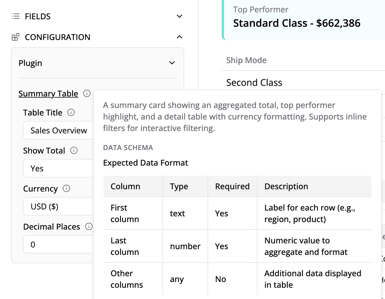
},Where Documentation Appears
Publishing to Semaphor
One-Time Setup
# Install the Semaphor CLI
npm install -g semaphor-cli

# Initialize your plugin
semaphor init
During initialization, provide:
- Type:
Plugin - Name: Your plugin name (e.g.,
my-company-charts) - Build path:
dist - Project ID: From Semaphor project settings
- Project Secret: From Semaphor project settings
Build & Publish Workflow
# Build the plugin
npm run build

# Publish to Semaphor
semaphor publish
This uploads:
dist/index.js— Your bundled componentsdist/style.css— Your stylesdist/manifest.json— Component metadata
Using in Semaphor
- Open your dashboard in Semaphor
- Add or edit a card
- Click the chart type selector
- Find your visual under "Custom Visuals"
- Configure data source and settings
- Optionally configure inline filters
Troubleshooting
"Element type is invalid. Received a promise that resolves to: undefined"
This is the most common error. It occurs when component names don't match across files.
Symptom:
Error: Element type is invalid. Received a promise that resolves to: undefined.
Lazy element type must resolve to a class or function.
Cause: Name mismatch between configuration and exports.
Example of the problem:
// components.config.ts
{
  component: 'RevenueChart';
} // Expects 'RevenueChart'

// index.ts
export { RevenueChart } from '...'; // Exports 'RevenueChart'

// revenue-chart.tsx
export function MyRevenueChart() {} // ❌ Wrong! Exports 'MyRevenueChart'
Fix: Ensure all three names match exactly:
// components.config.ts
{
  component: 'RevenueChart';
}

// index.ts
export { RevenueChart } from './semaphor-components/revenue-chart/revenue-chart';

// revenue-chart.tsx
export function RevenueChart() {} // ✅ Correct!
Checklist when renaming components:
- Function name in
.tsxfile - Export in
index.ts -
componentfield incomponents.config.ts - Key in
sample-data-registry.ts - Run
npm run build
Component Not Appearing in Semaphor
- Verify export: Is the component exported in
index.ts? - Check config: Is it registered in
components.config.ts? - Verify names match: Does
componentexactly match the exported function name? - Rebuild and republish:
npm run build && semaphor publish - Hard refresh: Clear browser cache and reload Semaphor
Data is Empty
- Configure data source: Ensure the card has a data source in Semaphor
- Check column names: Verify you're accessing correct column names
- Add debugging:
console.log('data:', data)to inspect - Handle empty state: Always check
if (!data || data.length === 0)
Inline Filters Not Showing
- Default to
[]: EnsureinlineFilters = []in props - Check conditional: Use
inlineFilters.length > 0 - Configure in Semaphor: Inline filters must be added to the card in Semaphor's UI
Styling Issues
- Import CSS: Verify
../index.cssis imported inindex.ts - Tailwind classes: All Tailwind utilities are available
- Theme colors: Use
theme?.colorsfor consistent colors - Dark mode: Check
theme?.mode === 'dark'
Showcase Not Showing Component
- Check registry: Is the component registered in
sample-data-registry.ts? - Verify key: The registry key must match the component name exactly
- Check data file: Ensure
.data.tsexportssampleData
Build Errors
# Clean rebuild
rm -rf dist node_modules
npm install
npm run build
Best Practices
Component Design
- Handle empty states — Always check for missing/empty data
- Provide defaults — Default all settings and props
- Use theme colors — Match the dashboard aesthetic
- Support dark mode — Check
theme?.mode - Be responsive — Use flex/grid layouts
Performance
- Memoize calculations — Use
useMemofor expensive computations - Virtualize long lists — Consider virtual scrolling for large datasets
- Lazy load — Split large components
Naming
- PascalCase — Component names:
RevenueChart - kebab-case — File names:
revenue-chart.tsx - Consistency — Match names across config, exports, and functions
API Reference
Type Definitions
// Query result row
type Record = {
  [columnName: string]: string | number | boolean;
};

// Query results array
type Data = Record[];

// Theme configuration
type CustomCardTheme = {
  colors: string[];
  mode: 'light' | 'dark' | 'system';
};

// Filter option
type TSelectedRecord = {
  value: string | number | boolean;
  label?: string;
};

// Visual configuration
type VisualConfig = {
  name: string;
  component: string;
  componentType: 'chart';
  chartType?: string;
  icon?: string;
  dataInputs?: string[];
  settings?: Record<string, SettingConfig>;
  docs?: VisualDocumentation;
};

// Filter configuration
type FilterConfig = {
  name: string;
  component: string;
  filterType?: string;
  icon?: string;
  supportedDataTypes?: string[];
  settings?: Record<string, SettingConfig>;
  docs?: FilterDocumentation;
};

// Setting configuration
type SettingConfig = {
  title: string;
  defaultValue: string;
  ui: 'input' | 'select';
  options?: { label: string; value: string }[];
  docs?: { description: string };
};

// Visual documentation
type VisualDocumentation = {
  description: string;
  dataSchema: string;
  useCases?: string[];
};

// Filter documentation
type FilterDocumentation = {
  description: string;
  useCases?: string[];
};
Support
- Documentation: docs.semaphor.cloud
- Email: support@semaphor.cloud
- GitHub Issues: Bug reports and feature requests