Charts
Heatmap Chart
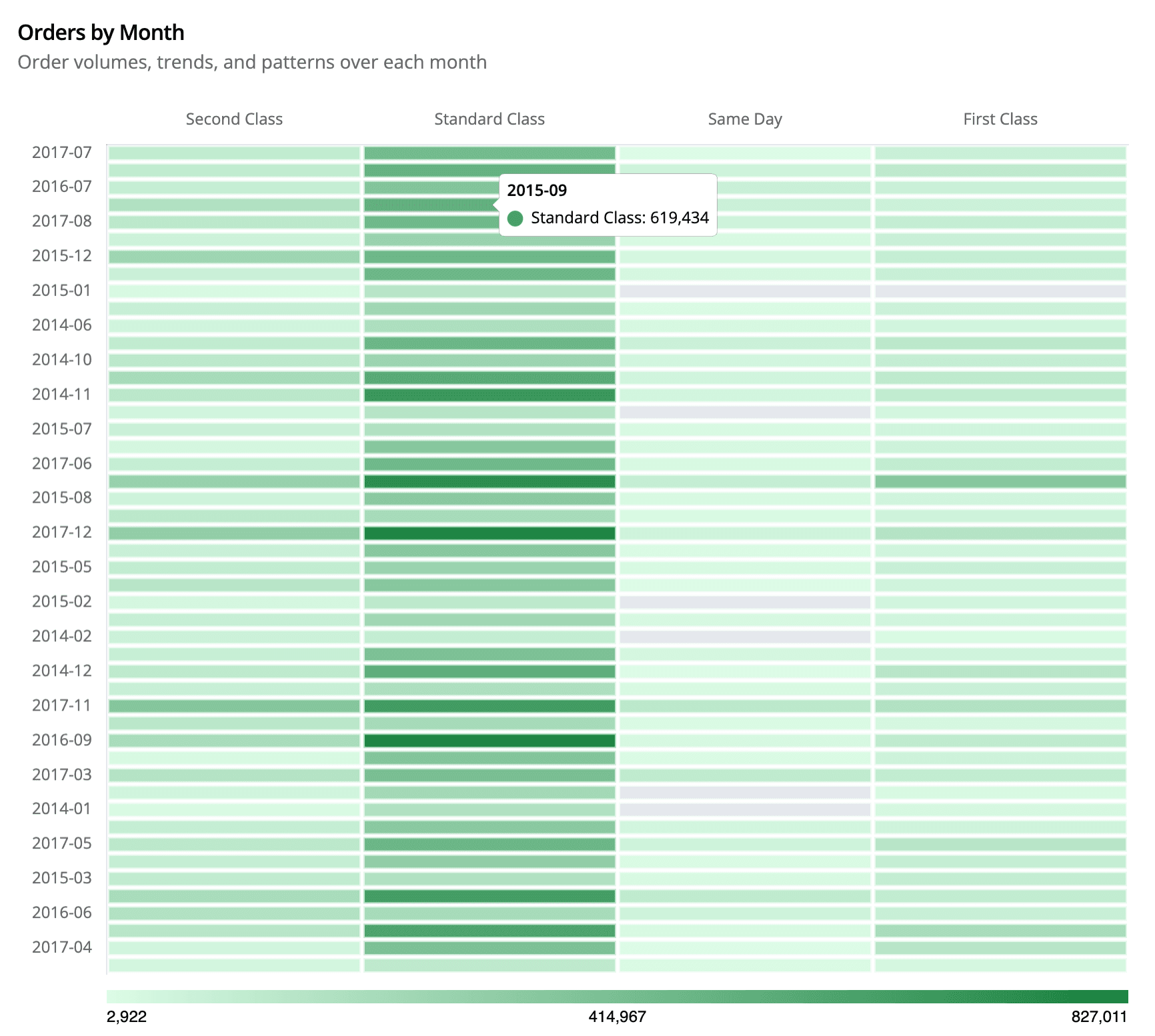
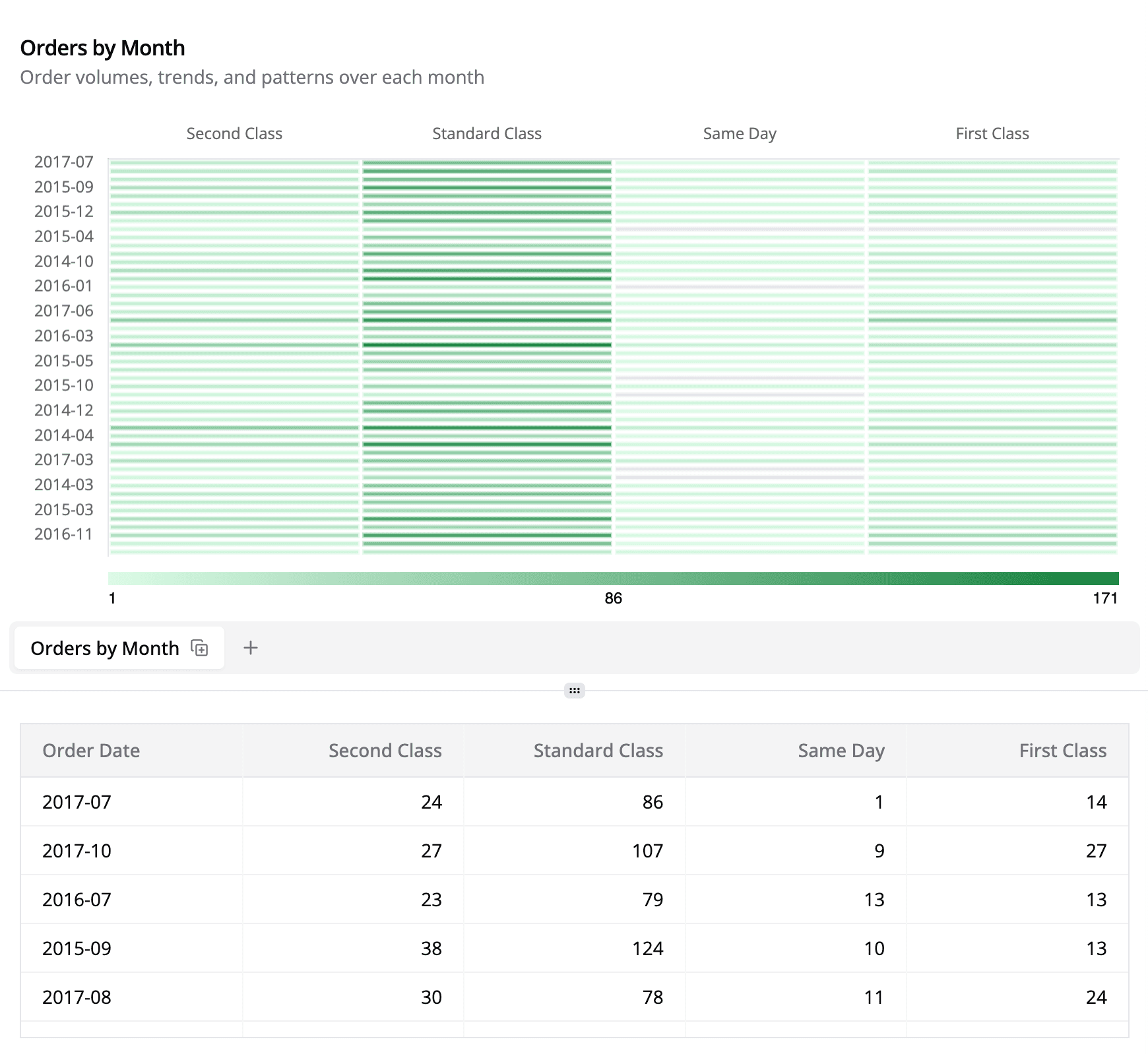
Visualize intersections of two categorical dimensions using color intensity.
Heatmaps display how a single metric varies across the intersection of two categorical dimensions. Each cell in the grid represents the pair (X, Y) and the cell color encodes the magnitude of the chosen measure.
Data Requirements
| Requirement | Details |
|---|---|
| Two categorical columns | These become the X-axis and Y-axis. In Explorer they come from Rows + Columns; in SQL mode you provide two string columns. |
| One numeric metric | Encoded as color intensity. |
Explorer Workflow (Standard Mode)
| Drop Zone | Required | Notes |
|---|---|---|
| Rows | ✅ | Y-axis labels (rendered top→bottom). |
| Columns | ✅ | X-axis labels. If omitted, Semaphor treats each metric column as a secondary axis. |
| Metrics | ✅ | First metric becomes the value v. Additional metrics are ignored by default. |
- Drag fields – Place your primary category (e.g.,
Order Date) in Rows and the secondary category (e.g.,Ship Mode) in Columns. Add the numeric field (e.g.,Count of Orders) to Metrics.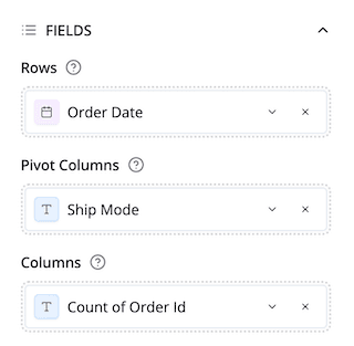
- Switch the visual – Open the Chart Quick Selector → Heatmap. Semaphor auto-detects the axes and metric based on the drop zones.
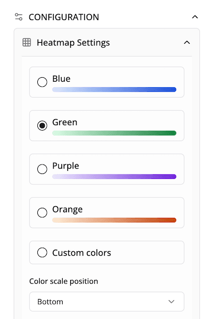
- Tune appearance – In Configuration → Heatmap Colors, pick one of the preset palettes (Green is the default) or switch to Custom to set start/end colors. Use “Color scale position” to move the gradient legend to any side of the chart.
- Format values – Use the global Data Labels panel to toggle numeric labels, select the format (number, currency, percent), and adjust font size. Heatmaps always center the label within the cell for readability.
SQL Workflow (Dev Mode)
When your are working in SQL and python, Semaphor infers field roles by column order. Provide two categorical columns followed by a numeric column.
SELECT
  region,          -- Y-axis
  segment,         -- X-axis
  SUM(sales) AS total_sales
FROM orders
GROUP BY 1, 2
ORDER BY region, segment;
Result grid preview:
| region | segment   | total_sales |
| ------ | --------- | ----------- |
| East   | Consumer  | 1_469       |
| East   | Corporate | 877         |
| East   | Home Ofc. | 502         |
| West   | Consumer  | 1_672       |
Switch the card type to Heatmap. Semaphor automatically uses region for the rows, segment for the columns, and total_sales for the value.
Customization Reference
| Option | Location | Description |
|---|---|---|
| Palette presets | Configuration → Heatmap Colors | Choose Blue / Green / Purple / Orange. Green is the default; each palette is tuned for accessibility. |
| Custom colors | Same panel | Switch to Custom colors to pick your own start/end gradient via inline color pickers. |
| Color scale position | Same panel | Move the gradient legend to the top, bottom, left, or right. Useful when embedding the chart in tall cards. |
| Data labels | Configuration → Data Labels | Toggle labels, pick format (auto/number/currency/percent/none), and adjust size. |
| Legend toggle | Configuration → Legend | Heatmaps default to legend off. Turn it on if you want the standard Chart.js legend in addition to the gradient scale. |