React
Embed Semaphor dashboard in your React app
This section outlines step-by-step instructions for integrating the Semaphor dashboard into your React app. If you don’t have a React project yet, you can set one up using Vite's guide.
1. Install Semaphor package
Run the following command in your project directory to install the semaphor package:
npm install semaphor2. Obtain the Auth Token
Before rendering a Dashboard, you need to retrieve an Auth Token. This token ensures secure access to your dashboard.
Use the following function to fetch the token:
const DASHBOARD_ID = 'd_cf007a8b-19bc-46ad-8787-2915445b7b86'; // Replace with your actual dashboard ID
const DASHBOARD_SECRET = 'ds_f32f0b30-b7e1-40f9-ba6a-9804a5b9d635'; // Replace with your actual dashboard secret
const TOKEN_URL = 'https://semaphor.cloud/api/v1/token';

async function fetchToken() {
  try {
    const response = await fetch(TOKEN_URL, {
      method: 'POST',
      headers: {
        'Content-Type': 'application/json',
      },
      body: JSON.stringify({
        dashboardId: DASHBOARD_ID,
        dashboardSecret: DASHBOARD_SECRET,
      }),
    });
    if (!response.ok) {
      throw new Error(`HTTP error! status: ${response.status}`);
    }

    const token = await response.json();
    if (token?.accessToken) {
      setAuthToken(token);
    }
  } catch (error) {
    console.error('There was an error!', error);
  }
}
Security Note
Do not expose DASHBOARD_SECRET in client-side code in production. Use a
backend service to fetch the token securely.
See the Token API reference for all available options including security policies, user provisioning, and multi-tenancy.
You can also customize dashboard chrome per token. Use config.showDashboardHub, config.showDashboardSharing, and config.showGroupManagement to hide those controls without changing the user's underlying permissions. See Feature and Dashboard Chrome Visibility.
3. Render the Dashboard
IMPORTANT: Make sure you import style.css either at the beginning of your component or in your global CSS file. This step is necessary for correctly loading the dashboard styles.
Client only React
import { useEffect, useState } from 'react';
import { AuthToken, Dashboard } from 'semaphor';
import 'semaphor/style.css'; // IMPORTANT! Include the CSS file. This is the default style, you can customize it.

function App() {
  const [authToken, setAuthToken] = useState<AuthToken>();

  return (
    <div>
      <Dashboard authToken={authToken} id={DASHBOARD_ID} />
    </div>
  );
}
Server side framework: NextJS
import { useEffect, useState } from 'react';

// Dynamic import to prevent server-side rendering.
const Dashboard = dynamic(
  () => import('semaphor').then((mod) => mod.Dashboard),
  {
    ssr: false,
  }
);

import 'semaphor/style.css'; // IMPORTANT! Include the CSS file. This is the default style, you can customize it.

function App() {
  const [authToken, setAuthToken] = useState<AuthToken>();

  return (
    <div>
      <Dashboard authToken={authToken} id={DASHBOARD_ID} />
    </div>
  );
}
Full Code
Here is the complete React code that uses the above steps. You can copy and paste this example into your application.
import { useEffect, useState } from 'react';
import { AuthToken, Dashboard } from 'semaphor';
import 'semaphor/style.css'; // IMPORTANT! Include the CSS file. This is the default style, you can customize it.

const DASHBOARD_ID = 'd_cf007a8b-19bc-46ad-8787-2915445b7b86'; // Replace with your actual dashboard ID
const DASHBOARD_SECRET = 'ds_f32f0b30-b7e1-40f9-ba6a-9804a5b9d635'; // Replace with your actual dashboard secret
const TOKEN_URL = 'https://semaphor.cloud/api/v1/token';

function App() {
  const [authToken, setAuthToken] = useState<AuthToken>();

  useEffect(() => {
    async function fetchToken() {
      try {
        const response = await fetch(TOKEN_URL, {
          method: 'POST',
          headers: {
            'Content-Type': 'application/json',
          },
          body: JSON.stringify({
            dashboardId: DASHBOARD_ID,
            dashboardSecret: DASHBOARD_SECRET,
          }),
        });
        if (!response.ok) {
          throw new Error(`HTTP error! status: ${response.status}`);
        }

        const token = await response.json();
        if (token?.accessToken) {
          setAuthToken(token);
        }
      } catch (error) {
        console.error('There was an error!', error);
      }
    }
    fetchToken();
  }, []);

  return (
    <div>
      <Dashboard showAssistant authToken={authToken} />
    </div>
  );
}

export default App;
Self-Service Dashboards (Surfboards)
The Surfboard component allows you to embed the full self-service analytics experience directly into your product. This feature is ideal for platforms that want to empower their customers to explore data independently and build personalized dashboards.
Key Benefits
-
Interactive Chart Building: Customers can create their own charts and dashboards using a simple drag-and-drop interface.
-
Custom Lenses: Each user can create their own lens—a personalized version of a parent dashboard—tailored to their specific needs.
-
Personalized Layout Users can rearrange visuals and customize layout to highlight the insights most relevant to them.
Usage
To enable the self-service experience, use the Surfboard component in your app:
<Surfboard showAssistant authToken={authToken} />Auth Token Configuration
To generate the authToken, you must provide specific user and dashboard information. This ensures each user has access to their own lens and appropriate permissions:
const data = {
  dashboardId: 'your-dashboard-id', // ID of the parent dashboard
  dashboardSecret: 'your-dashboard-secret', // Secure key for the dashboard
  endUserId: user.id, // Unique identifier for the end user
  endUserEmail: user.email, // Email for identification and personalization
  allowEdit: true, // Enables editing and lens creation
  config: {
    showDashboardHub: false, // Keep the user in this embedded dashboard
    showDashboardSharing: false, // Hide the Share button
    showGroupManagement: false, // Hide Manage Groups under More options
  },
  // cls: cls, // Optional: Connection-level security policy
};allowEdit: When set to true, users can create and save their own dashboards (lenses).endUserId: Ties lens creation and activity to a specific user.cls(optional): Enforces row-level security using Connection-Level Security policies.
Use Surfboard to offer customers a powerful analytics experience—combining no-code flexibility with advanced capabilities like SQL and Python directly within your application. It enables users to tailor dashboards to their specific business questions and encourages deeper engagement through hands-on data exploration.
Key Considerations
- Security Note: Keep the
DASHBOARD_SECRETsecure and do not expose it in client-side code in production. This example is for demonstration purposes only. When deploying in production, obtain the authentication token from a secure, server-side environment. - Fetching the AuthToken: You need pass
AuthTokento theDashboardcomponent. In this example, theuseEffecthook is used to fetch the token when the component mounts.
Event Handlers
Both the Dashboard and Surfboard components support event handlers that let your application respond to user interactions on the cards. These handlers provide a flexible way to extend functionality such as capturing user actions, triggering workflows, or integrating with other systems.
Available Today
-
onExportDataTriggered when a user exports data from a dashboard card.When a custom
onExportDatahandler is provided, Semaphor will execute your handler instead of performing the default action of downloading a file. This gives you full control over the export process, allowing your application to use the SQL query and result set to trigger custom reporting workflows, send data to external systems, or log exports for compliance.type ExportDataPayload = { cardId: string; // Unique identifier for the card title: string; // Card title data: Record<string, any>[]; // Exported data rows };
Usage Example:
const handleExport = (payload: ExportDataPayload) => {
  console.log('Exported data:', payload);
  // Example: send data to a backend or analytics service
};

<Dashboard authToken={authToken} onExportData={handleExport} />;
Coming Soon
Additional event handlers will soon be available to support a broader range of user interactions, including:
-
onDrillDown– Fired when a user drills into a data point for more detail. -
onFilterChange– Triggered when filters are applied or updated. -
onRefresh– Called when a card or the dashboard is refreshed. -
onError– Reports if a card fails to load or encounters a runtime error.
These events will help you build more interactive and context-aware experiences with embedded analytics.
Utility Hooks
Semaphor provides hooks to programmatically interact with the dashboard, allowing you to bring your own custom elements like date pickers, dropdowns, etc.
This is useful if you're looking to consolidate all filters into a dedicated filter panel within your app.
Currently, Semaphor provides the following hooks. More coming soon.
useTextFilteruseDateFilter
To use these hooks, you need to wrap the parent component with the SemaphorDataProvider. This is required to ensure that the hooks are properly initialized.
import { DashboardContainer } from './DashboardContainer';
import { SemaphorDataProvider } from 'semaphor';

function App() {
  return (
    <SemaphorDataProvider>
      <DashboardContainer>
    </SemaphorDataProvider>
  );
}
Custom Filters
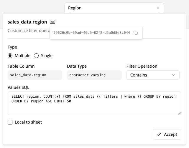
First, get the filterId from the Semaphor console (found under the filter settings ⚙️ popover).
Now you can use the hooks inside the DashboardContainer component to read and update the state of the filters.
import {
  useDateFilterHook,
  useTextFilterHook,
  type TSelectedRecord,
  type DateRange,
} from 'semaphor';

function DashboardContainer() {
  // Access the hooks
  const {
    records,
    selectedRecords, // current selection of the filter
    handleChange: handleTextFilterChange,
    handleClear: handleTextFilterClear,
  } = useTextFilterHook('your_text_filter_id');

  const {
    initialDataRange, // initial date range of the filter
    dataRange, // current date range of the filter
    handleChange: handleDateFilterChange,
    handleClear: handleDateFilterClear,
  } = useDateFilterHook('your_date_filter_id');

  function applyTextFilter() {
    handleTextFilterChange([
      {
        id: 'First Class',
        value: 'First Class',
      },
    ] as TSelectedRecord[]);
  }

  function applyDateFilter() {
    handleDateFilterChange({
      from: new Date('2014-01-04T09:00:00Z'),
      to: new Date('2014-01-20T09:00:00Z'),
    } as DateRange);
  }

  return (
    <div>
      <button onClick={applyTextFilter}>Apply Text Filters</button>
      <button onClick={() => handleTextFilterClear()}>Handle Text Clear</button>

      <button onClick={applyDateFilter}>Apply Date Filters</button>
      <button onClick={() => handleDateFilterClear()}>Handle Date Clear</button>

      <Dashboard authToken={authToken} id={DASHBOARD_ID} />
    </div>
  );
}
Dropdown Example for Text Filters
const {
  records,
  selectedRecords, // current selection of the filter
  handleChange: handleTextFilterChange,
  handleClear: handleTextFilterClear,
} = useTextFilterHook('your_text_filter_id');

return (
  <select
    value={selectedRecords[0]?.value}
    onChange={(e) =>
      handleTextFilterChange([{ id: e.target.value, value: e.target.value }])
    }
  >
    {records?.map((record) => (
      <option key={record.id} value={record.value}>
        {record.value}
      </option>
    ))}
  </select>
);
Custom Placeholders
Semaphor allows you to customize default placeholders in the dashboard. For example, you can display a custom message or a custom image when the message when the no records are found or when the dashboard session is expired. This allows you to provide a more personalized experience that aligns with your application's branding.
You can customize the placeholders by passing the placeholders prop in the Dashboard compoent.
const placeholders = {
  NoRecords: <div>No records found</div>,
  SessionExpired: <div>Your session has expired. Please login again.</div>,
}

<Dashboard
  ...
  placeholders={placeholders}
/>
Note
You can pass any React.ReactNode type to placeholders, which allows strings,
images, icons to be displayed.