Funnel Chart
Learn how to create Funnel Chart in Semaphor
Funnel Charts are a great way to visualize how values compare across categories, especially when you're looking to show a drop-off or conversion across stages.
🧠 How It Works
To create a Funnel Chart, your SQL query should return two columns:
- The first column represents the category or segment (e.g., steps in a process, product types, user actions).
- The second column is a numeric measure representing the size or count for each category.
Chart Shape
Make sure to sort the results in descending order based on the metric. Funnel charts rely on this to visually emphasize progression or drop-off.
🛠️ Example Query
SELECT ship_mode, -- Segment label
COUNT(*) AS count -- Numeric value
FROM sales_data
GROUP BY ship_mode
ORDER BY count DESC
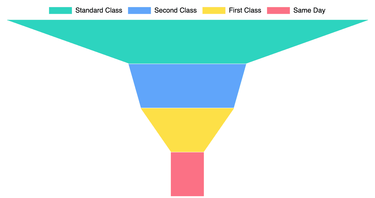
LIMIT 10📈 Sample Output
| Ship Mode      | Count |
| -------------- | ----- |
| Standard Class | 5968  |
| Second Class   | 1945  |
| Same Day       | 543   |
| First Class    | 538   |
This would produce a funnel chart where Standard Class appears at the top as the widest bar, narrowing down to First Class at the bottom — visually illustrating drop-offs across shipping methods.
🎨 Customization
You can modify the style of the chart by adjusting the shrinkAnchor property in the visual settings.
For example, changing shrinkAnchor from 'top' to 'bottom' will shift the way the funnel compresses, giving you more visual flexibility.
➡️ For more info, refer to the official funnel chart docs.