Scatter & Bubble Charts
Plot relationships between two or three numeric variables on a coordinate plane.
Scatter and bubble charts visualize the relationship between numeric variables. Each point represents a data row positioned by its X and Y values. Bubble charts add a third dimension by sizing each point according to a third metric.
Data Requirements
| Requirement | Scatter | Bubble |
|---|---|---|
| 1 label dimension | Identifies each point (shown in tooltip). | Same as scatter. |
| 2 numeric metrics | X-axis and Y-axis values. | X-axis and Y-axis values. |
| 3rd numeric metric | — | Drives bubble size. Semaphor scales radius automatically. |
Optional: A second dimension enables grouping—each unique value becomes a color-coded series with its own legend entry.
Explorer Workflow (Standard Mode)
| Drop Zone | Required | Notes |
|---|---|---|
| Rows | ✅ | First dimension = point label. Optional second dimension = grouping (creates series). |
| Pivot Columns | 🚫 | Not used for scatter/bubble. |
| Metrics | ✅ | Metric 1 = X-axis, Metric 2 = Y-axis, Metric 3 = bubble size (bubble chart only). |
Steps
- Add dimensions – Drag your label field (e.g.,
Product Name) to Rows. To group points by category, add a second dimension (e.g.,Region). - Add metrics – Drag three numeric fields to Metrics: X value, Y value, and size value. For scatter charts, only the first two are used.
- Select chart type – Open the chart selector and choose Scatter or Bubble.
- Configure options – Use the Bubble/Scatter Configuration panel to fine-tune radius scaling, axis titles, and grouping behavior.
SQL Workflow (Dev Mode)
In SQL mode, Semaphor uses positional column mapping. Arrange your SELECT columns in this order:
| Position | Role | Chart Type |
|---|---|---|
| 1 | Label (dimension) | Both |
| 2 | X-axis (metric) | Both |
| 3 | Y-axis (metric) | Both |
| 4 | Size (metric) | Bubble only |
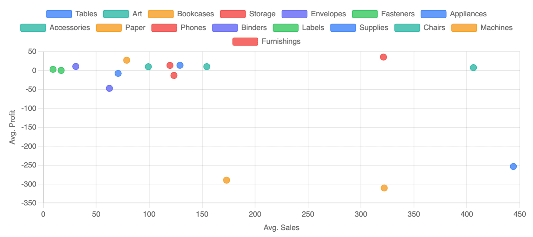
Scatter Chart Example
SELECT
    sub_category,                   -- label
    AVG(sales) AS avg_sales,        -- x-axis
    AVG(profit) AS avg_profit       -- y-axis
FROM orders
GROUP BY sub_category| sub_category | avg_sales | avg_profit |
| ------------ | --------- | ---------- |
| Tables | 443.93 | -253.54 |
| Chairs | 328.45 | 45.12 |
| Phones | 321.25 | 35.59 |Switch the card type to Scatter. Semaphor automatically maps sub_category as the label, avg_sales as X, and avg_profit as Y.
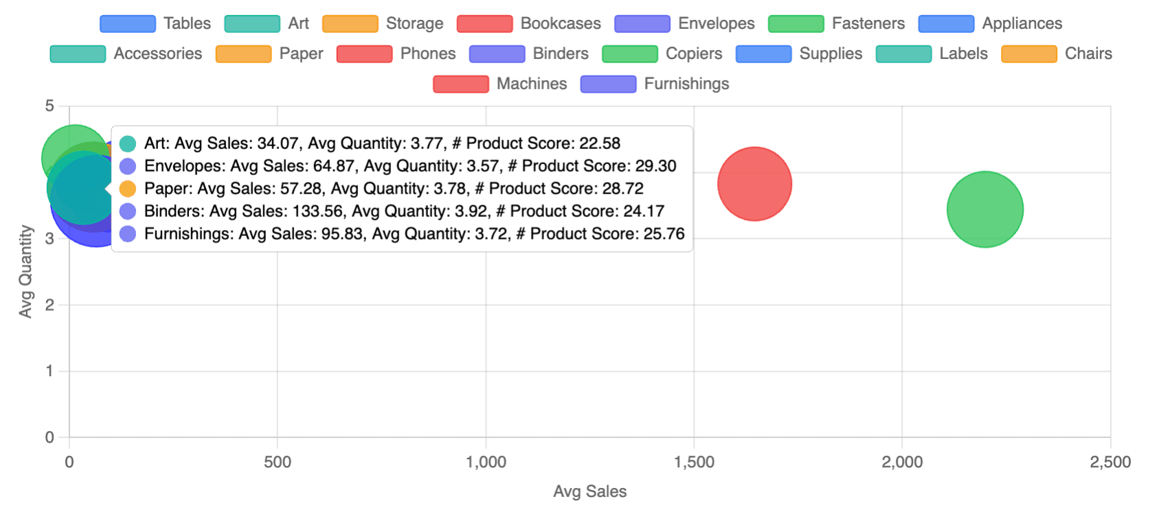
Bubble Chart Example
SELECT
    sub_category,                   -- label
    AVG(sales) AS avg_sales,        -- x-axis
    AVG(quantity) AS avg_quantity,  -- y-axis
    AVG(score) AS product_score     -- bubble size
FROM orders
GROUP BY sub_category
Switch the card type to Bubble. The fourth column (product_score) now drives the bubble radius.
Grouping (Color-Coded Series)
Add a second dimension to create grouped series. Each unique value gets its own color, and the legend displays automatically.
Explorer Mode
Drag two dimensions to Rows:
- First dimension = point label (shown in tooltip)
- Second dimension = group (creates separate colored series)
SQL Mode
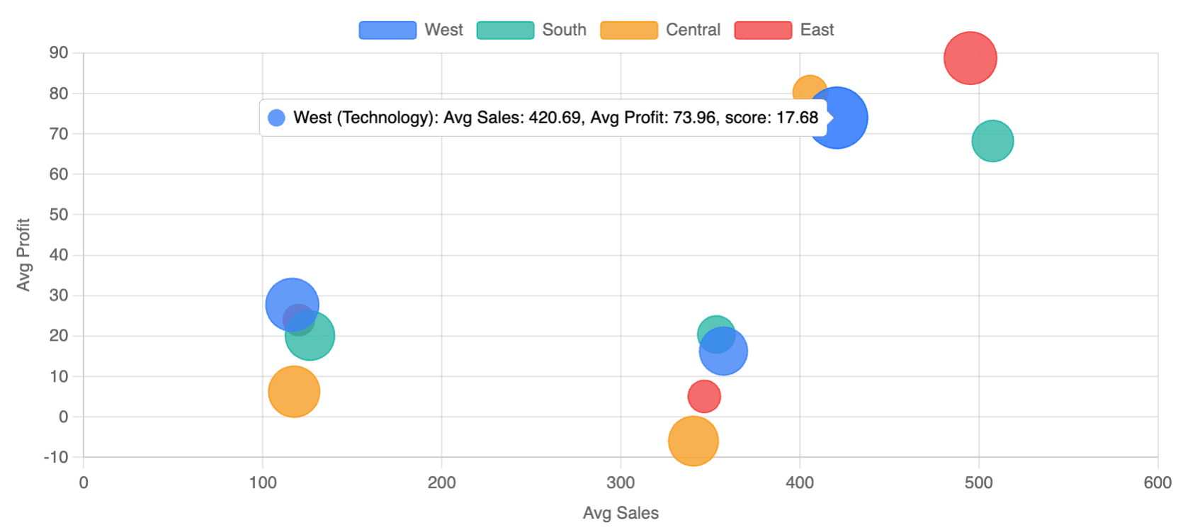
When grouping is enabled, include the group column as the second column:
SELECT
    category,                       -- label
    region,                         -- group (legend)
    AVG(sales) AS avg_sales,        -- x-axis
    AVG(profit) AS avg_profit,      -- y-axis
    AVG(score) AS score             -- bubble size
FROM orders
GROUP BY category, region| category | region | avg_sales | avg_profit | score |
| --------------- | ------- | --------- | ---------- | ----- |
| Technology | West | 420.69 | 73.96 | 17.68 |
| Technology | East | 495.28 | 88.71 | 18.53 |
| Office Supplies | West | 116.42 | 27.73 | 18.65 |
| Furniture | Central | 340.53 | -5.97 | 17.51 |Enable grouping in Configuration → Bubble/Scatter → Enable Grouping and select the group column. The legend appears on the right by default.
Customization Reference
| Option | Location | Description |
|---|---|---|
| Radius Scaling | Configuration → Bubble/Scatter | Choose sqrt (default, perceptually accurate), linear, or fixed (uniform size). |
| Min/Max Radius | Same panel | Control the smallest and largest bubble sizes (default: 5–30 pixels). |
| Axis Titles | Configuration → Bubble/Scatter → Axis | Toggle axis labels on/off and customize the title text. Defaults to metric names when enabled. |
| Grouping | Same panel | Enable/disable grouping and select which dimension to group by. |
| Legend | Configuration → Legend | Auto-shows when grouping is enabled. Position defaults to right; can be moved to top/bottom/left. |
| Data Labels | Configuration → Data Labels | Show point labels on the chart. Positioned below each point by default. |
| Number Format | Configuration → Number Axis Format | Apply formatting (decimals, currency, suffix) to axis ticks and tooltips. |
Tooltip Behavior
Tooltips show all relevant information for each point:
- Title: Point label (and group name if grouped)
- X value: Metric name with
(x)annotation - Y value: Metric name with
(y)annotation - Size value: Metric name with
(size)annotation (bubble only)
Best Practices
- Choose scatter for relationships: Use scatter charts when you want to show correlation between two variables without emphasizing magnitude.
- Choose bubble for three dimensions: Use bubble charts when a third metric (like market size or volume) adds meaningful context.
- Keep point counts reasonable: Charts with 50–200 points are ideal. More than 500 points can become cluttered.
- Use grouping sparingly: 2–5 groups work well. Too many groups make the legend overwhelming and colors hard to distinguish.
- Enable axis titles: When sharing dashboards, axis titles help viewers understand what each axis represents without checking the data source.