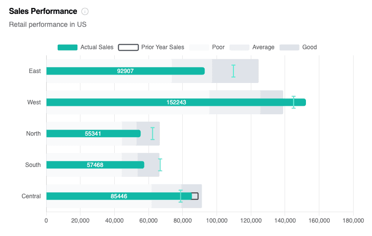
Bullet Chart
Compare an actual metric against targets and qualitative ranges.
Bullet charts condense a KPI into a single lane: a solid bar shows the actual value, a marker represents the target, and optional comparative/qualitative cues add context.
Period and target comparisons
On a bullet visual you build in the editor, open the metric settings to set a Previous period, Previous year, or Target baseline. A target shows as a reference marker; a period comparison uses the actual earlier values. The visual can also inherit Previous period or Previous year from the Global Date control.
This is different from adding a second or third metric as your own target or comparison value. Metrics you add by hand, and columns from your own SQL, don't get built-in comparisons. See Metric Comparisons.
Data Requirements
| Requirement | Details |
|---|---|
| Rows | Dimension for each lane (Region, Product, Rep, etc.). |
| Metric 1 (required) | Actual value rendered as the solid bar. |
| Metric 2 (optional) | Target value shown as a marker. |
| Metric 3 (optional) | Comparative measure (e.g., prior period). |
| Metric 4–6 (optional) | Poor / Satisfactory / Good thresholds for qualitative ranges. |
Explorer Workflow
| Drop Zone | Required | Notes |
|---|---|---|
| Rows | ✅ | One dimension per lane; order controls how rows are listed. |
| Columns (Metrics) | ✅ | Add metrics in the order: Actual → Target → Comparative → Ranges. |
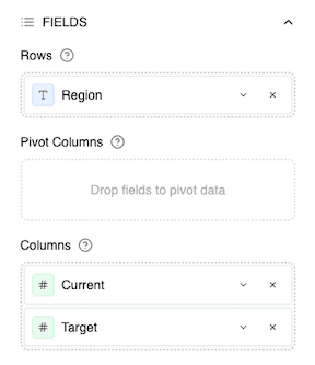
- Drag fields into Rows/Columns, then pick Bullet from the Chart Quick Selector.
- Assign target/comparative metrics in the Bullet panel or disable them entirely.
- Turn on qualitative ranges to show the gray bands. Map Poor / Satisfactory / Good to columns or enter manual values (e.g., 0.6 / 0.85 / 1.05).
- Adjust orientation & labels using the global Orientation toggle and Data Labels panel.
Supplying Qualitative Ranges
You can map Poor / Satisfactory / Good to dedicated columns (Metrics #4–6) or type manual values. When only actual + target metrics exist, Semaphor auto-builds simple ranges with default percentages that you can override later.
SQL Workflow (Dev Mode)
Provide columns in the same order. Semaphor infers roles automatically.
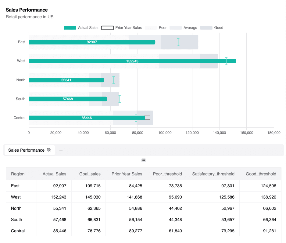
SELECT
  region,
  SUM(actual_sales)      AS Actual_sales,
  SUM(target_sales)      AS Goal_sales,
  SUM(prior_year_sales)  AS prior_year_sales,
  AVG(poor_threshold)    AS poor_threshold,
  AVG(satisfactory_thr)  AS satisfactory_threshold,
  AVG(good_threshold)    AS good_threshold
FROM regional_sales
GROUP BY region;| region | actual_sales | goal_sales | prior_year_sales | poor_threshold | satisfactory_threshold | good_threshold |
| ------ | ------------ | ---------- | ---------------- | -------------- | ---------------------- | -------------- |
| East | 4_200_000 | 4_500_000 | 3_900_000 | 2_500_000 | 3_600_000 | 4_800_000 |
| West | 3_200_000 | 3_500_000 | 3_000_000 | 2_000_000 | 3_000_000 | 3_900_000 |Switch the card to Bullet Chart. Semaphor automatically uses the first numeric column as the actual bar, the second as the target marker, the third as the comparative outline, and the remaining metrics as qualitative ranges when enabled.
Customization Reference
| Option | Location | Description |
|---|---|---|
| Target metric | Bullet configuration | Pick any metric (or None) for the marker line. |
| Comparative metric | Bullet configuration | Toggle the comparative outline on/off or map a different column. |
| Qualitative ranges | Bullet configuration | Enable the gray bands and choose column-based or manual values. |
| Fallback target | Bullet configuration | Provide a number used when the selected target metric is missing. |
| Orientation & data labels | Standard configuration panels | Use the Orientation toggle and Data Labels panel to match other charts. |
Usage Tips
- Limit to ~10 lanes per chart so viewers can scan quickly.
- Use ranges only when they add context; hide them for simple goal-vs-actual stories.
- Hide the comparative outline if the extra series clutters the lane.