Charts
Radar Chart
Learn how to create a radar chart in Semaphor
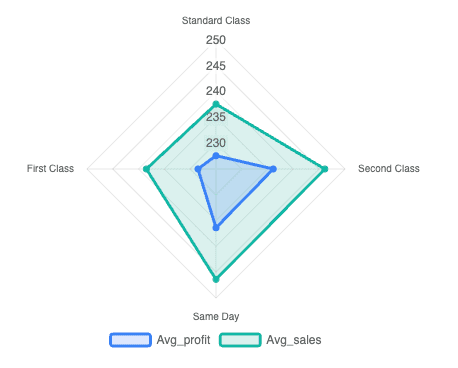
Radar charts are useful for comparing multiple quantitative measures across different categories. Each category is represented as a label on the chart, while numerical measures define the values plotted along each axis.
You can create a radar chart using the following query structure.
- The first column (categorical) is mapped to the label.
- The subsequent columns (numerical) are mapped to the measure.
SELECT ship_mode, -- label
AVG(profit) as Avg_Profit, -- measure
AVG(sales) as Avg_Sales -- measure
FROM sales_data
GROUP BY ship_mode| Ship Mode | Avg_Profit | Avg_Sales |
| -------------- | ---------- | --------- |
| Standard Class | 227.58 | 237.58 |
| Second Class | 236.09 | 246.09 |
| Same Day | 236.40 | 246.40 |
| First Class | 228.50 | 238.50 |This example shows two series of data, Avg_Profit and Avg_Sales. You can add as many series as you would like. Each series should be a seperate measure column in the query.