Range Chart
Learn how to create a range chart in Semaphor
A range chart displays the variation between two data points over a period, highlighting the difference between minimum and maximum values. Ideal for visualizing ranges such as temperature fluctuations, price intervals, salary ranges, etc.
Simple Range Chart
You can display a simple range chart using the following query structure.
- The first column (categorical) is mapped to the
y-axis. - The second column (categorical) is mapped to the
group. - The third column (numerical) is mapped to the
fromvalue. - The fourth column (numerical) is mapped to the
tovalue.
SELECT
sub_category, -- y-axis (dimension)
'Profit Range' as group, -- chart label
MIN(profit) as min_profit, -- from value
MAX(profit) as max_profit  -- to value
FROM sales_data
GROUP BY sub_category
ORDER BY sub_category DESC
The group column is used to display the legend.
| sub_category | group        | min_profit | max_profit |
| ------------ | ------------ | ---------- | ---------- |
| Tables       | Profit Range | 319        | 629.01     |
| Supplies     | Profit Range | 190        | 327.51     |
| Storage      | Profit Range | 846        | 792.27     |
| Phones       | Profit Range | 889        | 1228.18    |
| Paper        | Profit Range | 1370       | 352.3      |
| Machines     | Profit Range | 115        | 2799.98    |
| Labels       | Profit Range | 364        | 385.38     |
| Furnishings  | Profit Range | 957        | 387.57     |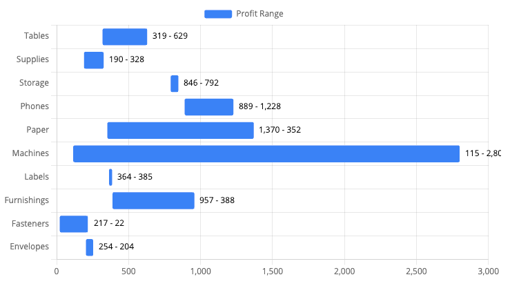
Custom Range Chart
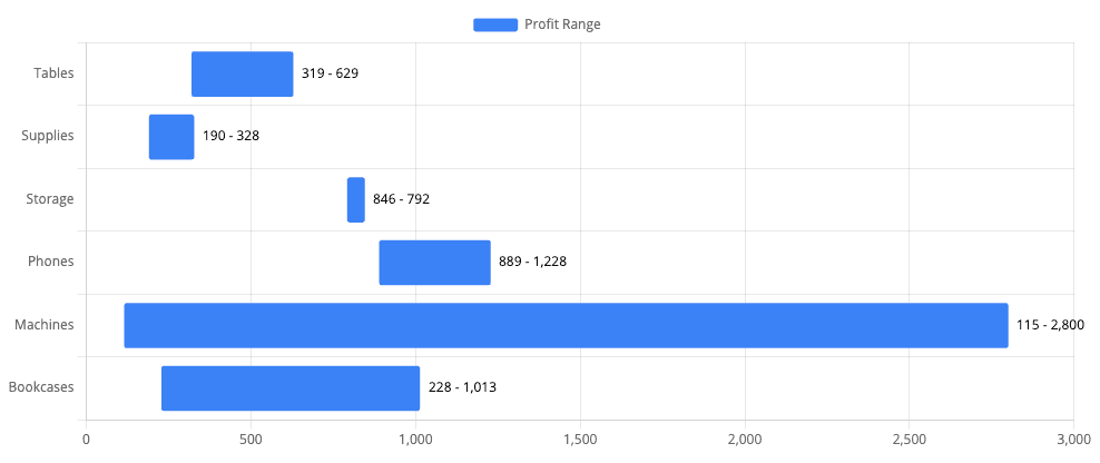
In certain cases, you might want to include a midpoint value within the range. For example, when displaying the minimum, mean, and maximum salary for a specific job role, you can achieve this by adding a thrid number column to the query, as shown below.
SELECT
sub_category, -- y-axis (dimension)
'Profit Range' as group, -- chart label
MIN(profit) as min_profit, -- from value
MAX(profit) as max_profit,  -- to value
AVG(profit) as avg_profit  -- mid value
FROM sales_data
GROUP BY sub_category
ORDER BY sub_category DESC| sub_category | group | min_profit | max_profit | avg_profit |
| ------------ | ------------ | ---------- | ---------- | ---------- |
| Tables | Profit Range | 319 | 629.01 | 244 |
| Supplies | Profit Range | 190 | 327.51 | 294 |
| Storage | Profit Range | 846 | 792.27 | 325 |
| Phones | Profit Range | 889 | 1228.18 | 350 |
| Machines | Profit Range | 115 | 2799.98 | 329 |
| Bookcases | Profit Range | 228 | 1013.13 | 285 |As you can see, even though you have provided the avg_profit, the chart below currently displays only two values: min_profit and max_profit.
To include avg_profit, you'll need to customize the chart by drawing a line at that specific value. You can achieve this by adding the below code snippet to the Custom Code section of the visual.
function toolTipLabel(tooltipItem) {
  const data = tooltipItem.raw; // Get the raw data for the hovered item
  const minValue = data[0];
  const maxValue = data[1];
  const midValue = data[2];

  if (minValue === null || maxValue === null) {
    return null;
  }

  return `Min: ${minValue}, Max: ${maxValue}, Mid: ${midValue}`;
}

function drawLine(chart) {
  const ctx = chart.ctx;
  const xScale = chart.scales.x;
  chart.data.datasets.forEach(function (dataset, i) {
    const meta = chart.getDatasetMeta(i);
    meta.data.forEach(function (bar, index) {
      const value = dataset.data[index];
      const minValue = value[0];
      const maxValue = value[1];
      const midValue = value[2];
      const minMaxLabel = `Min: ${minValue}, Max: ${maxValue}`;
      const midLabel = `Mid: ${midValue}`;

      // Calculate the x position for the middle value based on the x-axis scale
      const xMid = xScale.getPixelForValue(midValue);
      const barTop = bar.y - bar.height / 2;
      const barBottom = bar.y + bar.height / 2;

      ctx.fillStyle = 'black';
      ctx.textAlign = 'center';
      ctx.textBaseline = 'middle';

      // Draw the line at the x-axis value
      ctx.beginPath();
      // ctx.setLineDash([1, 5, 6]); // Dashed Line
      ctx.moveTo(xMid, barTop); // Start at the top of the bar
      ctx.lineTo(xMid, barBottom); // End at the bottom of the bar
      ctx.strokeStyle = getDatalabelColor({ chart });

      ctx.lineWidth = 2; // Adjust line width as necessary
      ctx.stroke();
    });
  });
}

return {
  plugins: [
    {
      afterDatasetsDraw: drawLine,
    },
  ],
  options: {
    plugins: {
      tooltip: {
        enabled: true,
        callbacks: {
          label: toolTipLabel,
        },
      },
    },
  },
};
In the Explorer view, click on the Gear Icon ⚙️ to open the customize dialog, paste the above code and apply changes.
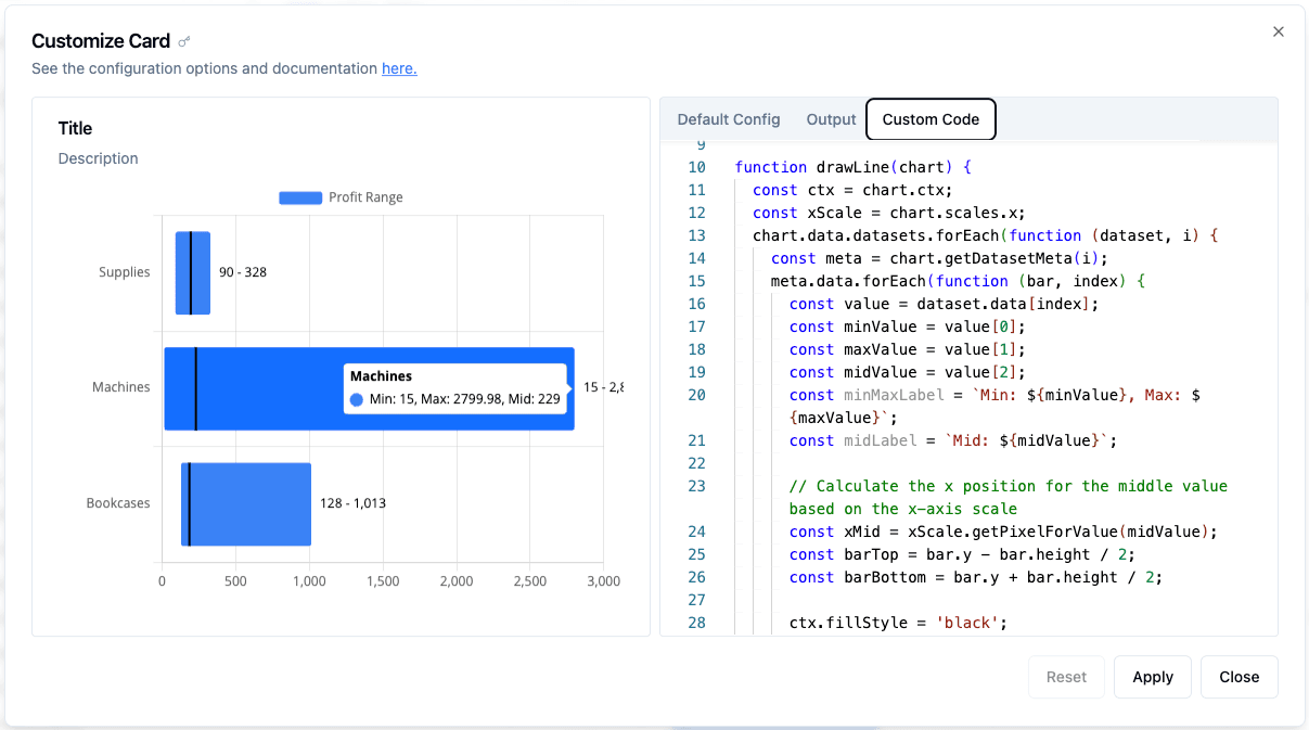
Now, you can see the line drawn at avg_profit, along with the updated tooltip displaying all three values. You can further customize the line style (e.g., dotted, dashed) by adjusting the code.
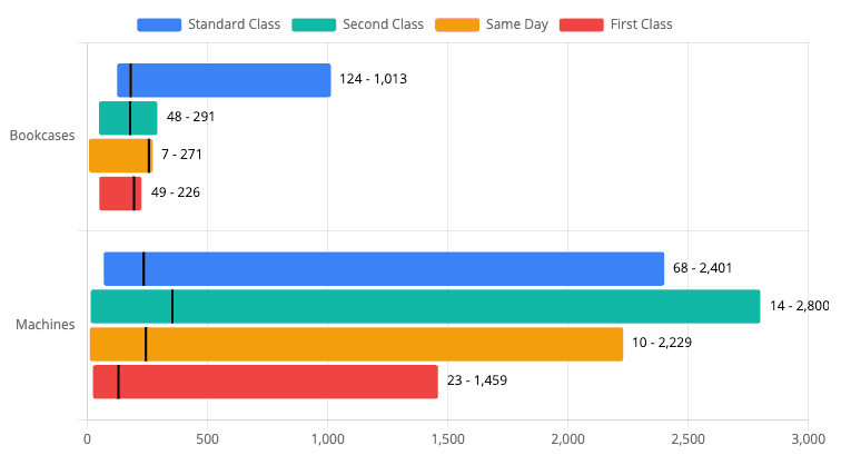
Split Range Chart
In some use cases, you might want to further split the ranges within by group. For example, you could break down the minimum, maximum, and average profit by ship mode across different sub-categories. You can structure your query like this:
SELECT
sub_category, -- y-axis (dimension)
ship_mode, -- group
MIN(profit) as min_profit, -- from value
MAX(profit) as max_profit,  -- to value
AVG(profit) as avg_profit  -- mid value
FROM sales_data
where sub_category in ('Machines', 'Bookcases')
GROUP BY sub_category, ship_mode
ORDER BY sub_category, ship_mode DESC
The ship mode column is used as a grouping column for the ranges.
| sub_category | ship_mode      | min_profit | max_profit | avg_profit |
| ------------ | -------------- | ---------- | ---------- | ---------- |
| Bookcases    | Standard Class | 124        | 1013.13    | 180        |
| Bookcases    | Second Class   | 48         | 291.38     | 179        |
| Bookcases    | Same Day       | 7          | 271.42     | 256        |
| Bookcases    | First Class    | 49         | 225.74     | 194        |
| Machines     | Standard Class | 68         | 2400.97    | 235        |
| Machines     | Second Class   | 14         | 2799.98    | 354        |
| Machines     | Same Day       | 10         | 2229.02    | 244        |
| Machines     | First Class    | 23         | 1459.2     | 130        |