Stacked Chart
Learn how to create a stacked chart in Semaphor
Period comparisons
Stacked bar, stacked line, and stacked area visuals you build in the editor can show period comparisons. A time-series comparison needs a date on the axis so the earlier values line up with the current ones. See Metric Comparisons. Columns you write in your own SQL stay ordinary series.
Stacked Bar Chart
You can generate a stacked line, bar, or area chart using the following query structure.
- The first column (categorical or time-based) is mapped to the x-axis.
- The second column (categorical) values form a stack.
- The third column (numerical) represents a metric.
SELECT
  TO_CHAR(DATE_TRUNC('month', order_date), 'MM-YYYY') AS month, -- x-axis
  category, -- stack-by
  COUNT(*) AS number_of_orders -- y-axis (number)
FROM
  sales_data
GROUP BY
  month, category
ORDER BY
month, category;| Month | Category | Number of Orders |
| ------- | --------------- | ---------------- |
| 01-2020 | Furniture | 22 |
| 01-2020 | Office Supplies | 45 |
| 01-2020 | Technology | 22 |
| 01-2021 | Furniture | 24 |
| 01-2021 | Office Supplies | 100 |
| 01-2021 | Technology | 31 |
| 01-2022 | Furniture | 15 |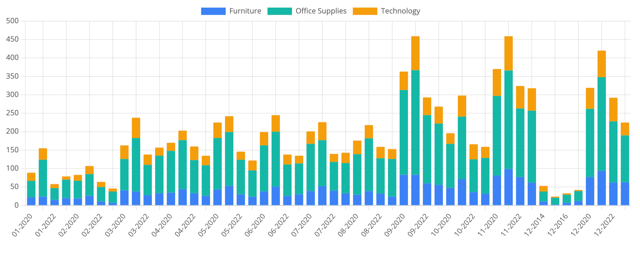
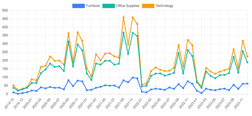
Stacked Line Chart
You can convert the above chart into a stacked line by modifying the dataset.type in the config as highlighted below.
 "datasets": [
   {
    "type": "line", // change to line type
    "label": "Furniture",
    "data": [],
    "backgroundColor": "#3b82f6",
    "borderColor": "#3b82f6"
   },
   {
    "type": "line", // change to line type
    "label": "Office Supplies",
    "data": [],
    "backgroundColor": "#14b8a6",
    "borderColor": "#14b8a6"
   },
   {
    "type": "line", // change to line type
    "label": "Technology",
    "data": [],
    "backgroundColor": "#f59e0b",
    "borderColor": "#f59e0b"
   }
  ]
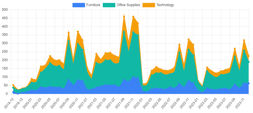
Stacked Area Chart
Similarly, you can convert the above chart into an area chart by providing the fill property as highlighted below.
"datasets": [
   {
    "type": "line", // change to line type
    "fill": "origin", // fill the area under the line
    "label": "Furniture",
    "data": [],
    "backgroundColor": "#3b82f6",
    "borderColor": "#3b82f6"
   },
   {
    "type": "line", // change to line type
    "fill": "origin", // fill the area under the line
    "label": "Office Supplies",
    "data": [],
    "backgroundColor": "#14b8a6",
    "borderColor": "#14b8a6"
   },
   {
    "type": "line", // change to line type
    "fill": "origin", // fill the area under the line
    "label": "Technology",
    "data": [],
    "backgroundColor": "#f59e0b",
    "borderColor": "#f59e0b"
   }
  ]
Stacked Combo Chart
To create a stacked combo chart with dual axis, you'll need to structure your query as shown below.
SELECT segment,
COUNT(*) as L1,
AVG(quantity) as L2,
AVG(profit) as L3,

Avg(sales) as B1,
AVG(revenue) as B2,
AVG(cost) as B3

FROM sales_data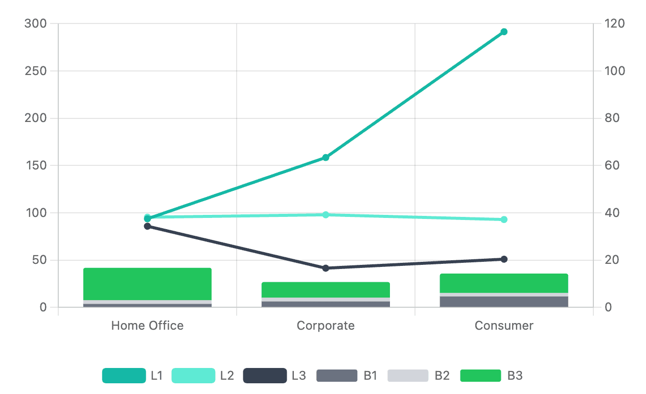
GROUP BY segment| Segment | L1 | L2 | L3 | B1 | B2 | B3 |
| ----------- | --- | --- | --- | --- | --- | --- |
| Home Office | 38 | 38 | 343 | 5 | 4 | 34 |
| Corporate | 63 | 39 | 166 | 8 | 4 | 17 |
| Consumer | 117 | 37 | 204 | 16 | 4 | 20 |The columns L1, L2, and L3 will be displayed as lines, while B1, B2, and B3 will be shown as stacked bars. We'll start by creating a basic bar chart and then modify it step by step.
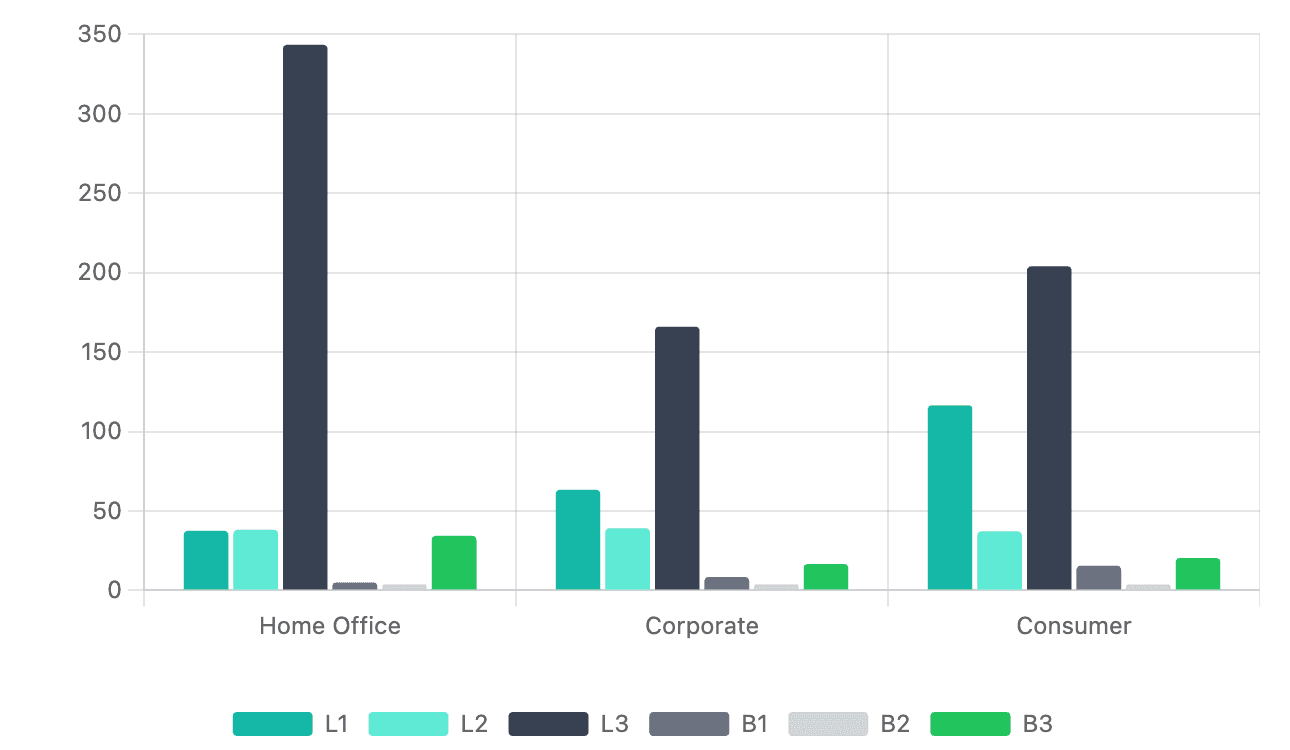
Step 1 - Bars to Lines
Convert L1, L2, L3 columns into lines by changing the dataset type in the Y-axis settings.
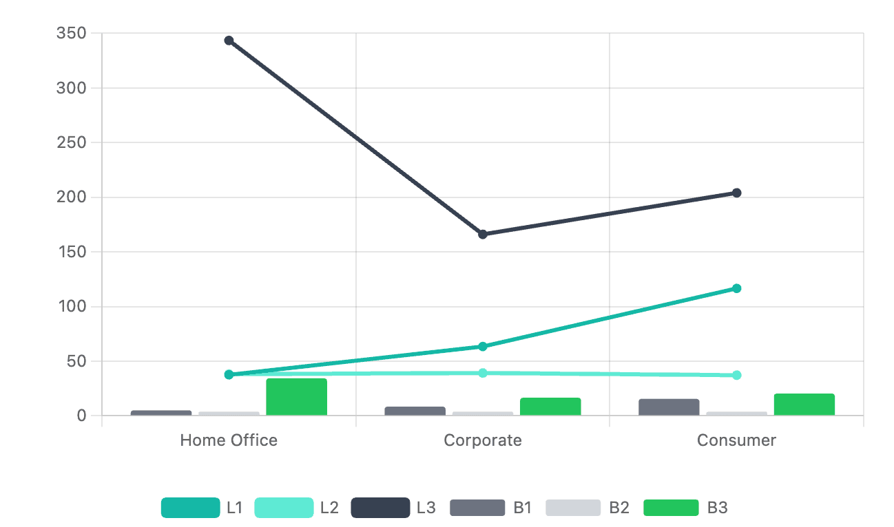
Step 2 - Stack the Bars
And then stack the the bars by setting stacked property to true for both x (options.scales.x) and y (options.scales.y) axes in the chart config.
"scales": {
   "y": {
    ...
    "stacked": true
   },
   "x": {
    ...
    "stacked": true
   }
}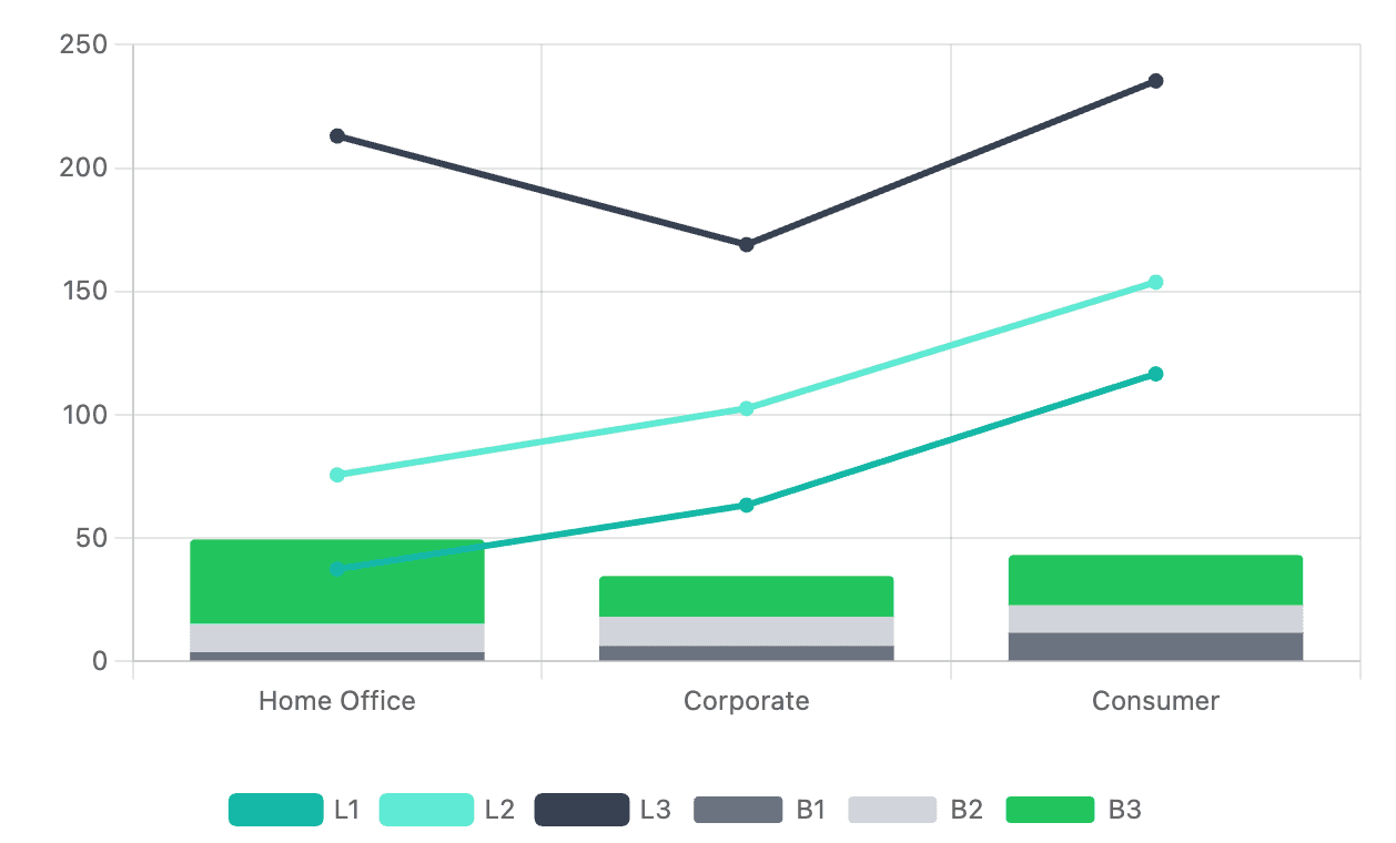
Step 3 - Dual Axis
You can further customize the chart by adding a secondary y-axis y1 for the lines
"y": {
...
},
"y1": {
    "type": "linear",
    "display": true,
    "position": "right",
    "grid": {
     "drawOnChartArea": false
    }
   }
And then assign the y1 axis to the lines by setting the yAxisID property in the dataset config like this:
"datasets": [
   {
    "label": "L1",
    ...
     "yAxisID": "y1"
   },
   {
    "label": "L2",
    ...
     "yAxisID": "y1"
   },
   {
    "label": "L3",
    ...
     "yAxisID": "y1"
   },
]
See the docs for more details.
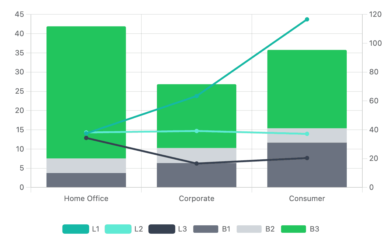
Step 4 - Axis Range
In some instances you might want to have different ranges for your y-axes. You can set this range by setting the min and max properties in the chart config.
"y1": {
  ...
  "min": 0,
  "max": 120
}