Visuals
Learn how to create visuals in Semaphor
Overview
Semaphor uses the open-source ChartJS 4 specification for its visuals. You can access the full ChartJS API to customize the look and feel of your charts. Here are some examples of how to quickly create common charts using simple SQL queries.
Bar / Line / Area Charts
You can create bar, line, or area charts by structuring your query as shown below.
- The first column (categorical or time-based) is mapped to the x-axis.
- The second column (numerical values) is mapped to the y-axis.
SELECT sub_category, -- x-axis
COUNT(*) -- y-axis (number)
FROM sales_data
GROUP BY sub_category
ORDER BY sub_category DESC LIMIT 100| sub_category | count |
| ------------ | ----- |
| Tables | 319 |
| Supplies | 190 |
| Storage | 846 |
| Phones | 889 |
| Paper | 1370 |
| Machines | 115 |
| Labels | 364 |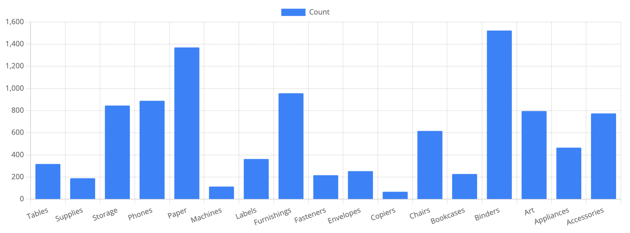
Usage Tips
- Ensure that the the values in the first column are categorical or time-based.
- Apply sorting (
ORDER BY) to improve readability. - Use
LIMITto control the number of data points for performance and clarity.